All desktop calculators are wrong, so I had to build my own!
(One of the most boring titles ever)
Writing this article wasn't easy. At first glance, it's all about a fairly unentertaining subject (building a calculator, the kind of exercise that every IT student tried at some point of its education), and to make the matter worse, it's pedantically advertised. But in the end, I believe that this article really brings out valuable features, highlights enjoyable development stories, and offers an interesting experience, so bear with me!
I built a desktop calculator called Chalk, which is free and supports macOS 10.9+. Because I had to make unconventional choices and introduce ideas that I never saw anywhere else before, my first task is to convince you that Chalk is more interesting than it looks.
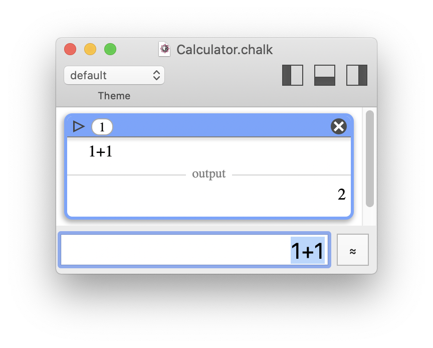 At least, the result is correct. But trust me, there's more to discover.
The first sections are organized as follows: an analysis of several common problems with software calculators, followed by a single summary of how Chalk solves them. I start with graphical interface considerations, and then dive deeper and deeper into advanced numerical concerns.
If you read all this article, you'll learn how I realized that everyone else was wrong (about calculators) and, hopefully, how I provided interesting solutions. You'll also encounter some illustrated opinions on software decay, the massive underuse of computing power, and Apple's stup very personal decisions regarding software and computer science. Now, you've been warned.
To me, it's always fascinating to see how a simple goal (writing a good program) may really be a silent excuse to learn new things and, eventually, reach unexpected larger considerations on a whole domain.
What kinds of software calculators are wrong?
(Why do we even have to ask? We deserve decent standard ones.)
The first thing I noticed was that when I needed to perform some calculations, I greatly preferred using a physical pocket calculator (at least a middle school level Casio or Texas Instruments, but some of the ideas I will develop also apply to more basic ones) rather than any desktop software calculator. How far can I push that statement?
From the very beginning of this article, I mentioned desktop calculators (or software calculators), as opposed to cell phone calculators. In my opinion, they both share flaws in their input and computation parts, but desktop calculators add insult to injury by using a design grossly inadequate for their context usage. By nature, cell phone calculators are much more likely to look like actual pocket calculators. But I will develop this aspect later, when I discuss the user interface.
Now, let's not artificially confuse things; I don't want to put software calculators on trial for not being Matlab or Octave, this is beyond the point. To be fair, most of the computations done on pocket calculators are daily life calculations: adding prices, splitting the bill, computing percentage reductions, or doing cross-multiplications. And even in the case of more advanced mathematics, my typical use remains: open my calculator, use it, then discard and forget it. Hence, I'm definitely not claiming that a big, serious computational software is the solution, I just want to be satisfied with a light, standard tool - and I'm not.
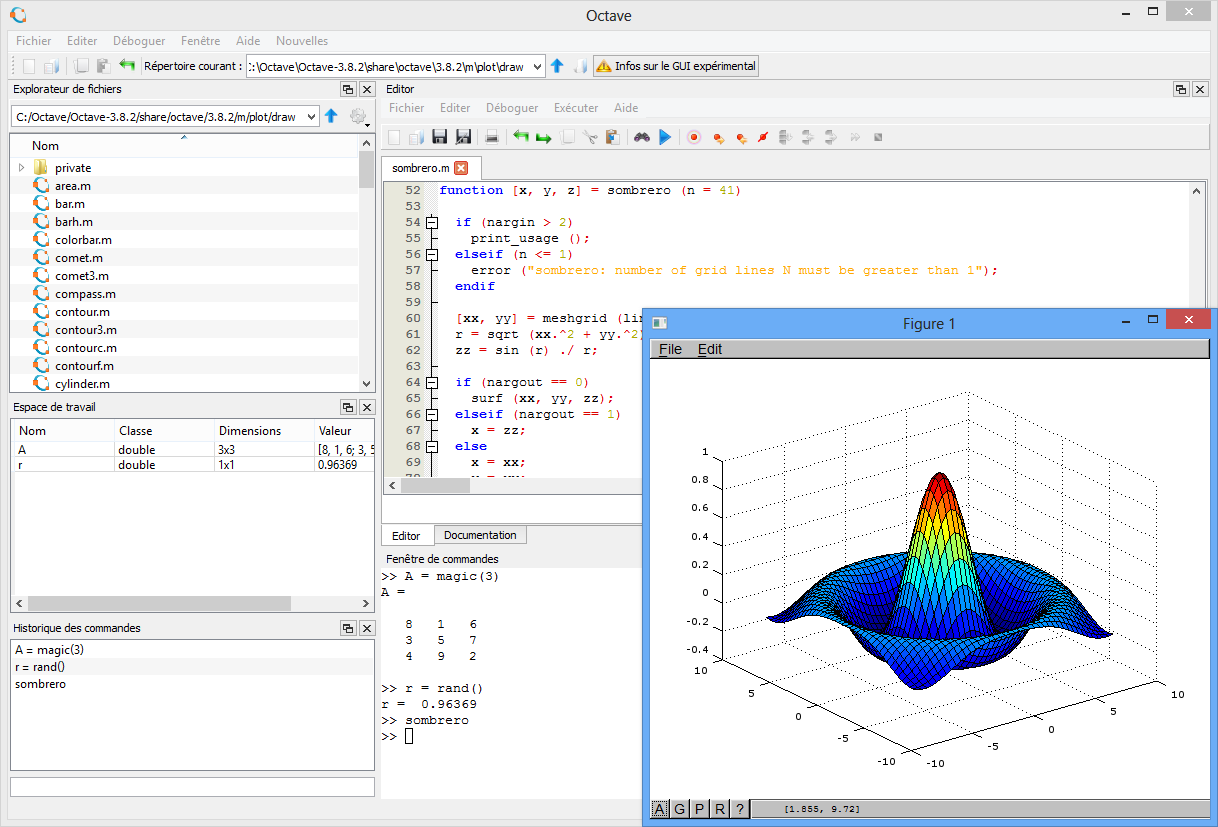 This (e.g. GNU Octave) is not the kind of software I'm accusing of being less handy than a pocket calculator. They just compete in different categories.
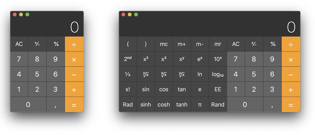 I'm rather against those types of flawed software designs, and I'll explain why.
What I need is a good, small calculator, and I can't be the only one given the abundance of calculators available on each and every app store. But why are there so many different ones? The fact that it is a good programming exercise can't be the sole reason. My opinion is that OSes (macOS, Windows, Linux… you name it) are simply not provided with a good calculator. Therefore, you're always looking for a better one, but there isn't a really good one, prompting this never-ending race.
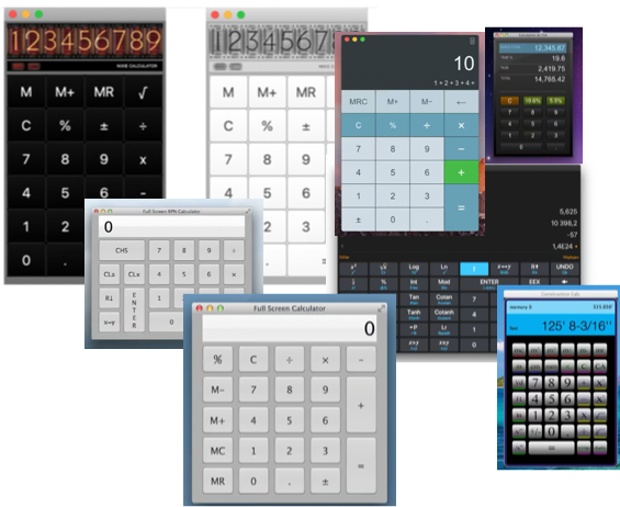 Here is a cherrypicked selection of desktop calculators available on the Apple App Store. But what is the purpose of all those copycats? They're all flawed in the same way.
Eventually, I realized that my favorite everyday software calculator
was simply the Google search engine, its major drawback being the requirement for an Internet access.
Thinking about it, it's quite a shame.
Just to drive the point home: does anyone remember that there is a compute
in computer
?
The little, standard calculator provided with an OS (and that nobody really likes) should be far more useful. Indeed, it should be seen as a basic tool, just like the file explorer, mail client, or web browser. We are in 2021, and macOS or Windows still provides default calculators that bother me more than they help me. They regularly take time to redesign them, but rarely (if ever) improve them. It's perfectly fine to sell a (specialized) software that required extensive development, but damn it: a good calculator should be a common good, not a luxury. Science should be part of our culture, and it is only natural that the standard offer for calculators should be free and of high quality.
<grumbling>A representative example: in the past, Apple made Grapher a free tool available with macOS 10.4. It was just so good to create dynamic curves and 3D rendering! Unfortunately, that was a buy-and-kill acquisition. There are multiple bugs that were never fixed, and it never became one of the killer features of macOS it should have been. Can you remember the last time Windows or macOS introduced a really good work-oriented feature that has real value in itself, and is not some kind of collaborative/Cloud/cross-device syncing/hype gadget?</grumbling>
Presentation: Software calculators are wrong even before computing.
After realizing that pocket calculators, or the Google search engine, were better than desktop calculators, I had to understand why, identifying failures of the latter in the process. Even if the first discrepancies I identified seemed trivial or unfair, it's been strangely satisfying to dig a little further: the lists of stumbling blocks ended up being rather long, having complex implications. Eventually, I developed the belief that we can't only fix desktop calculators to be as good as pocket calculators, but as well use some of these ideas to improve all calculators.
It's only fair to acknowledge that certain apps have already fixed some of these points, but I couldn't find a single app that fixed all of them (until Chalk, of course).
My Casio/TI calculator is quickly available, on demand.
Well, this is unfair. You can't compare a physical calculator with a piece of software that will, by nature, require space on your screen and won't be immediately available in the middle of a full-screen debug session. But what emerges from that idea is that I need a tool which is small, light, and easy to discard. It's fundamentally a reiteration of what is explained in Section 1.
Data entry feels much faster with my Casio/TI calculator.
Unfortunately, desktop calculators try to mimic the look and feel of pocket calculators. Although it feels like an intuitive solution, it ends up being a stack of obstacles to efficiency. Fixing that single point, without thinking about math yet, involves a huge reconsideration of user input. (Spoiler: By the way, I'm also very happy to bash flat design, which I truly hate.)
To explain this failure, let's consider the problem under the scope of interface efficiency, from two points of view:
- compactness
- input-system relevance
Compactness
I like interfaces where space isn't wasted, while keeping a good readability. Interface elements cleverly placed in close proximity should not require extra accuracy; they should rather help focus and embrace more information in one glance.
Apple used to do a pretty good job with its user interface (UI) guidelines… until they lost it and evolved in the opposite direction; even worse, they became the trendsetter! And it's all because of pocket calculators.
Think about it. Thanks to their physical keyboard, pocket calculators are designed to be both compact and handy, making data input easy and preventing you from hitting two keys at the same time. Now come the iPhone and touchscreen interfaces. Without haptic sensations, you are doomed to make larger buttons. Suddenly, you find that drawing edges with subtle depth illusion around these large, empty areas doesn't look that good. Hence, you get rid of any 3D effects and invent flat design. This is the new trend, so you use it too for desktop software for the sake of uniformity. And since it's the latest trend, everybody adopts it by fear of releasing a software looking deprecated. And kids, that's how you got to meet Windows 10's Calculator.
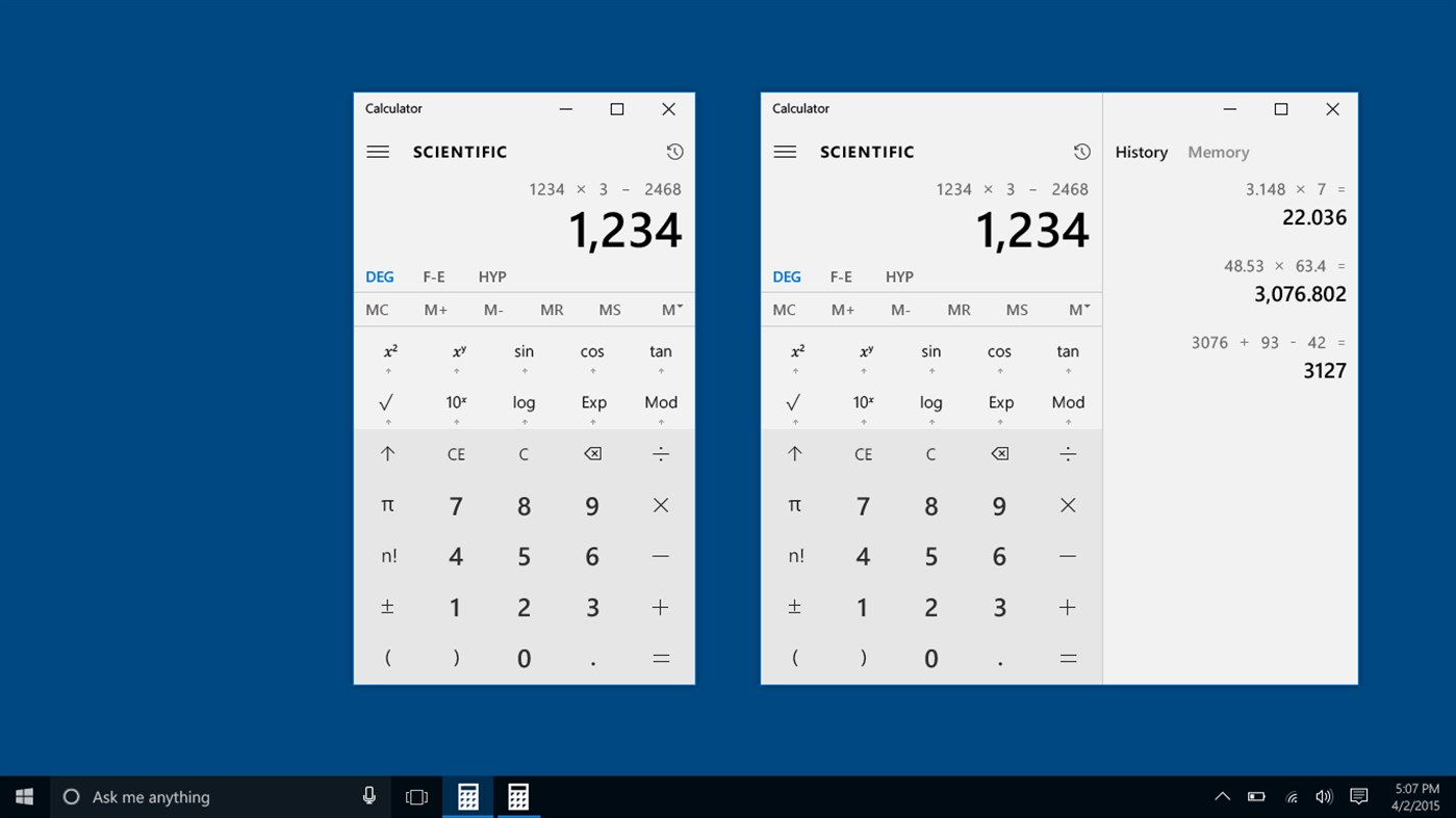 I hope your screen is large enough to perform 4-digit multiplications…
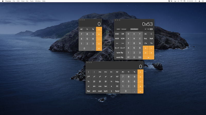 macOS Calculator doesn't mind wasting your precious screen space.
<grumbling>I truly hate flat design and lack of compactness. I just can't understand how it came to be accepted as the new norm. Laptop users with 13" screens know the pain, but nowadays, even on a 21" iMac, I often have to enlarge windows and scroll, thanks to the millions of useless pixels (while I'm at it, I'd like to tip my hat to Apple for the invention of invisible scrollbars, which deprive you from all the readily available and valuable information offered by these little sidebars. Not flat enough, I guess).
Yet, am I not wrong? Flat design isn't about compactness, but rather about render style, right? Sure, but when you try to create a compact interface with flat design, you end up with something that doesn't look like an interface anymore; most of the time, you can't identify visually the items you can interact with, and end up with a try-and-guess game, which slowly makes you give up on the idea that you are the user of the software, not the other way around.</grumbling>
An additional benefit of compactness becomes obvious when you need several calculators at the same time: at least they won't fill up the whole screen!
However, this argument is spurious. You rarely need two pocket calculators, while you often need two software calculator windows. If the software were good enough, you would rarely need two instances. This situation can mainly be attributed to poor interface design, and is discussed in the following sections (it's worth mentioning that macOS Calculator is so bad that you can't even open two instances, unless you cheat and use the Terminal, which isn't intended).
Larger calculator interfaces do not only reduce focus, they are also partly responsible for the loss of the light
feeling I expect from such tools. Unfortunately, this is not something that can be directly addressed with smaller buttons, and requires further consideration. Let me rephrase this: the input system of pocket calculators is adapted to compactness, in line with the actual dimensions of such objects in the real world. But literally transposed to a computer screen, it does not work any more: compactness is lost in the context of a screen workload. Desktop software should definitely not try to mimic the look and feel of pocket calculators, which is my next point.
Input system relevance
The design of pocket calculators is perfectly legible: a science-comprehensive keyboard doesn't fit in a reduced space, and you focus on implementing a set of shortcuts for the most useful operators.
Admittedly, the keyboard layout will change between manufacturers and even among different models from the same manufacturer, but this isn't a big deal. It works because you always keep an eye on what you are doing - the keys are just aside the calculator screen.
And that makes a huge difference with a desktop calculator, because in front of a software mimicking the buttons of a pocket calculator:
- you either look at your screen and click the keys with the mouse pointer, which is dramatically slow and inefficient;
- or, you believe that you can quickly touch type digits and operators, but you're lying to yourself since you don't have a numpad, and your gaze keeps going back and forth between the screen and the keyboard, which is as dramatically slow and inefficient;
- or, you do have a numpad and most of the time you're pretty fast, but as soon as you need an operator for which you don't know the shortcut, you need to refocus on the screen to click the key, which is also dramatically slow and inefficient.
In my opinion, there's only one way to be efficient: using the keyboard only. To this day, the versatility and speed of a keyboard are unmatched, and this is precisely what we need for a calculator – the input system shouldn't limit the expressiveness of the data.
So there is no real way out: data input on a computer, where the screen and keyboard are split, must not mimic the small keyboard of a pocket calculator. This is a typical example of irrelevant skeuomorphism. So why is this design so popular?
One funny thing is that in addition to being inconvenient, a keyboard-like interface is not easy to design! In order to make it attractive, visually balanced, and without empty areas, much time is spent on deciding the position and size of each and every button. Even funnier, developers often feel obligated to add to this complex puzzle functions such as m+/m-/mr, mainly to keep a familiar look
. I think I only know a few people who still know how M+ and M- should be used correctly, everyone else carefully avoiding these functions that are so easy to misuse. So, once again, isn't that a typical compactness and irrelevant failure? Not to mention that such functions have been implemented because of the resource limitations of basic calculators, and are a total nonsense on modern
computers.
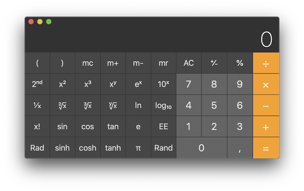 How many of us really know about the m+/m-/mr functions and are able to use them correctly? In other words, shouldn't we come up with another design that makes them unnecessary?
To conclude, I think that this look-alike design, usually justified as being reassuring for the user
, is rather an excuse to hide in plain sight the developer's laziness. Technically, basic calculators execute one instruction per action: whenever you hit a key, one action is triggered, which is very easy to program. But doing just a little better requires much more skill. And to explain why a little better means a lot here, let's introduce the next point: confidence.
I feel more confident about the result displayed on my Casio/TI calculator.
This section reflects the feeling that I trust my Casio calculator much more than I trust any software calculator. It may seem surprising, but it doesn't concern numerical operations (yet); it's more the fact that there is often a gap between what I wanted to compute and what I actually asked the software to do.
This is a very personal feeling, but it also happens to be the truth; I often need to perform a computation three times on a software calculator:
- the first time, to compute something;
- the second, to be sure the answer is correct;
- and the third, because I accidentally extended the previous computation, not starting from a neutral context, and got different results between the first and second times.
You don't believe me? Please check the video below, and see what context
means and the undesirable side effects it may have.
I just computed 32 after 1+2. Why is that "+2" added in the second computation? I didn't ask for it! There is a logical explanation, but it isn't an excuse… Would you still trust macOS Calculator after that?
In the above video, I'm at fault, because you don't need to hit the =
key after hitting the x2
key. Anyway, isn't that side effect a genuine trap? I shouldn't be so easily deceived just because all operators do not behave the same way regarding their validation!
Sure, I'm the culprit here, but was it avoidable with that poor input system? Moreover, I don't care who's the culprit, I just want the software to be designed well enough to let me check that I can trust myself. This is something I call active error checking.
Active error checking: It derives from the input system.
As mentioned above, the design of pocket calculators works because the compactness and haptic sensation help you type what you have in mind. On a virtual, on-screen keyboard, there is a very high chance of making mistakes, just by typing wrong. However, there are different kinds of typing mistakes:
- the ones you are immediately aware of (you know you slipped and want to undo immediately);
- the ones you are aware of too late (you slipped a few keys ago), and you either want to fix them or restart from the beginning;
- the ones that don't result from a slippage, but rather from a fault in the scheduling of the order in which you hit the keys (for instance you forgot to open a parenthesis), and you either want to fix them or restart from the beginning;
- and the ones you are simply not aware of.
And among those mistakes, there are three possible consequences:
- you're lucky, and it doesn't change the result (this is fairly unlikely, and doesn't interest us here);
- the input isn't valid and cannot be computed;
- or, the input remains valid and a result will be computed, but it won't be the one expected.
And since I'm aware of all these possibilities… I just want to be able to check my input!
How could we avoid such mistakes? Easy!
- The calculator should not compute until you validate the full expression.
- The calculator should display the expression during input, and allow you to correct any typing error you notice.
- The calculator should display the expression that has actually been evaluated.
And guess what? My Casio/TI calculator does exactly that, because it includes something called a screen
. Incredible! A screen! We could do so many things provided computers had one… Wait, what?!
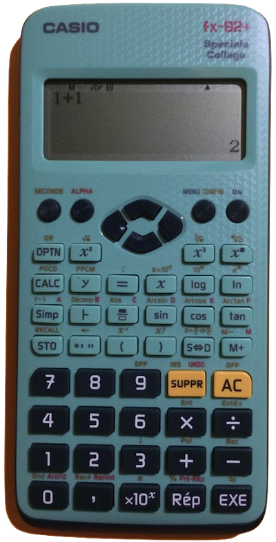 A middle school level calculator includes a great feature called a "screen". It allows you to see what you type, visually check that it's correct, and still see your input when you get the result.
* Windows Calculator almost does that: you can see the full input as you type, but it disappears upon hitting the final This has been recently fixed.=
.
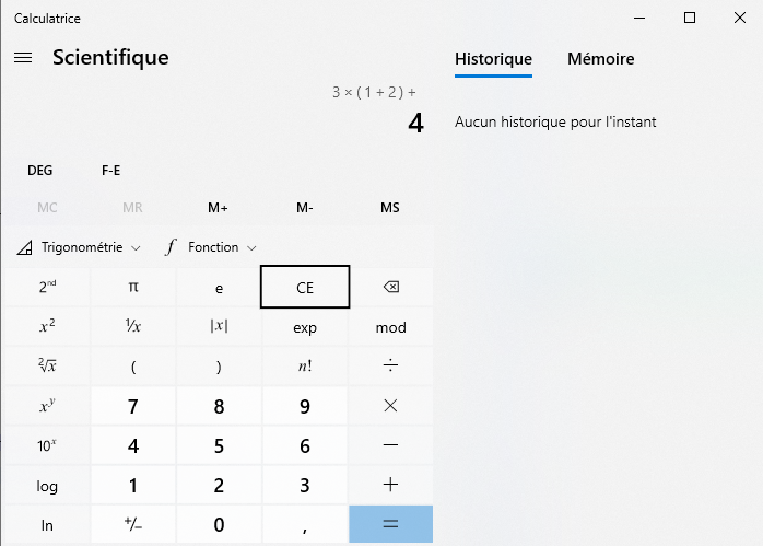 With Windows 10 calculator, you can see on top what you are typing, except the very last input that is not appended there until the next operator or computation.
- macOS Calculator simply doesn't… okay, it partly does! There is a
Paper tape
window. Paper… tape…
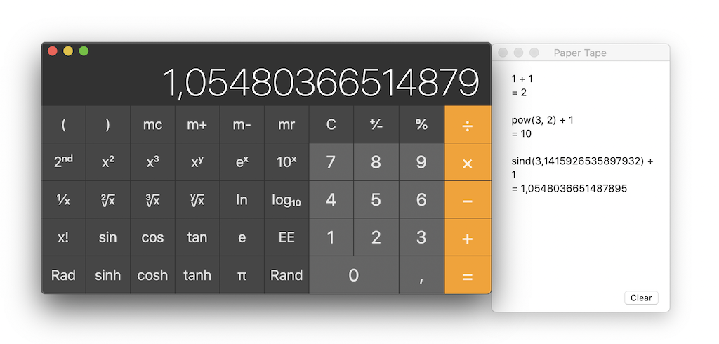 macOS Calculator includes a "Paper tape" window. A what? Does skeuomorphism go that far that you forgot that it's merely supposed to be a "history" feature?
The Paper tape window as seen above reveals many things; not the least of which is that I'm right to think that such a design is terrible!
- The
Paper tape
window is hidden by default – probably to maximize your chances of typing errors. - It's called
Paper tape
instead of History. Because you know… skeuomorphism… - It shows things you didn't type. In the above screenshot, I understand what
pow()
andsind()
are, because I used a squared exponent and a sinus. I'm smart enough to understand that sind() meanssinus in deg mode
, but I never typed and will never typep-o-w
ors-i-n-d
in this tool. There is a disturbing discrepancy between my input and the Paper tape presentation of that input. - It doesn't show the expression that you are currently typing, it waits for validation.
- Things may be computed (for unary operators like
sin
that have an immediate effect) without being visible on the Paper tape, unless you hit=
, which may have undesirable side effects as you can see in the video below. It looks like a bug of such unary operators, but I believe it has more to do with the fact that Apple didn't really understand the purpose of the Paper tape.
In this video, I'm trying to see the call for sin(π) in the Paper tape window. Since it doesn't appear, I hit "="… which triggers an undesirable side effect linked to the previous computation.
Jokes apart, the Paper tape
does a part of the job, and the name is not that stupid. It provides a visual error-checking window from which you can copy text. It remains flawed, but thanks to such a poorly designed tool, we can at least get a feel of what we really need.
- There is no point in presenting the input/result history in a separate window – you should always be able to see what you are doing and have done.
- The input should be a text input, to help you write long expression without errors.
- Copy/paste should be possible for long expressions.
History
Even if it's somewhat redundant with the active error checking
described in the previous section (which involved displaying full expressions), the history remains a different feature. Its purpose is to give access to previous computations, which help handle intermediate results and, potentially, control that you aren't propagating previous errors. The history is obviously better if it's also a renderer for the full expressions, but it's theoretically not mandatory. Since the Paper tape
solves both problems (when working correctly), they are often confused with each other.
But once again, my Casio/TI calculator does better than macOS Calculator, since it allows easy interaction with and reuse of previously computed expressions.
Pretty-print
Certainly, a calculator is better if it's able to draw mathematical symbols. Plain text expressions are ugly, especially when involving operations like square roots, powers, fractions… And here, ugly
means that your brain will have more work to embrace the expression, than if it was written with a canonical notation.
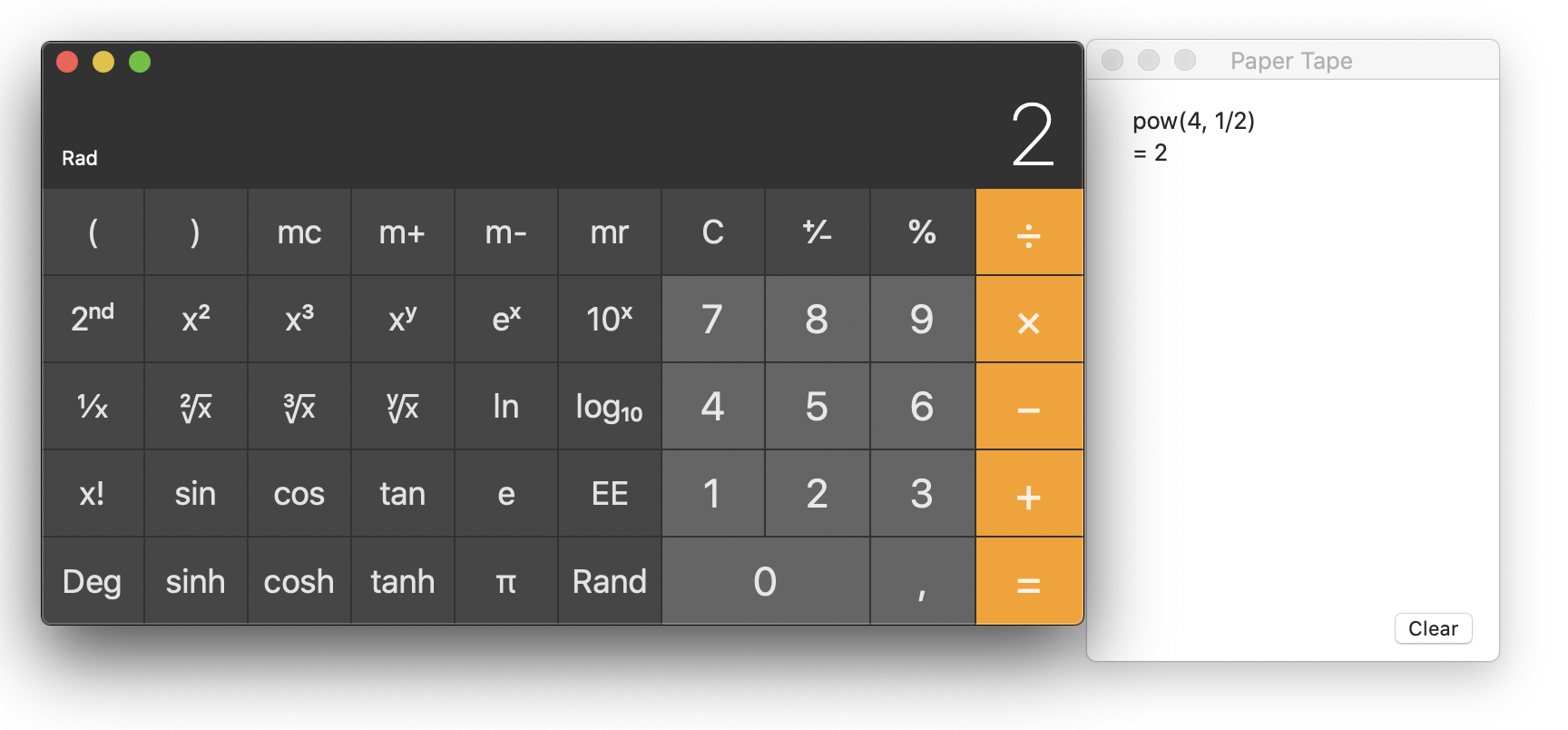 I computed √4. Despite being correct, not everyone will like the formulation "pow(4, 1/2)". Apple, are you drunk? Even sqrt(4) would have been more explicit.
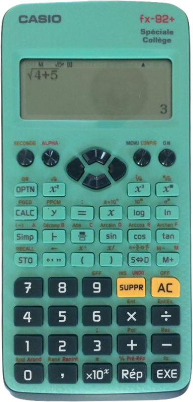 That pocket calculator offers a better rendering of this expression than most calculator software.
On a computer, which is millions of times more powerful than any pocket calculator, you almost never have a beautiful live rendering.
There is an additional constraint: since you often want to copy/paste your result elsewhere, you would ideally need two different versions of the output, a beautiful
one with an easier to read mathematical rendering, and a plain text
one to copy/paste and reuse as part of a new input.
My Casio/TI calculator has a single behavior for all user profiles, and it's fine.
Coming from the idea that people mainly use calculators for basic tasks, software calculator designers tacitly agreed to define three typical user profiles: basic, scientist, and programmer, each one with a dedicated interface/keyboard layout.
Why not? I'm not a huge fan of the basic/scientist separation, since the basic profile is really basic and does not offer any leeway. The separation between scientist and programmer is more divisive. The programmer profile allows you to work at the binary level, but for 64-bit integers only. In other words:
- as a programmer, you're not supposed to use floating-point numbers (and no large numbers anyway, you're limited to 64 bits);
- and as a scientist, you're not supposed to use programmer tools, like switching between different bases (2, 8, 16…).
I think this is another failure: all software calculators are wrong about their audience. I often have to switch between the interfaces, because none of them ever offers the right features.
On a pocket calculator, you have one keyboard layout, and you simply ignore the keys you don't use. Has this ever been a problem?
 Most people don't know the function of each key, but it's fine, nobody complains. It may even arouse curiosity and exploration.
"Modes" are evil.
This time I won't praise pocket calculators, because the next failure is one they are responsible for, the tedious modes
. More precisely, I mean the Rad
and Deg
modes, but the concept may apply elsewhere.
How many students got the wrong result just because they used radians instead or degrees, and vice versa? And by students
, I don't mean pupils
, this kind of error ages very well. In their defense, these modes are not very cleverly implemented in calculators.
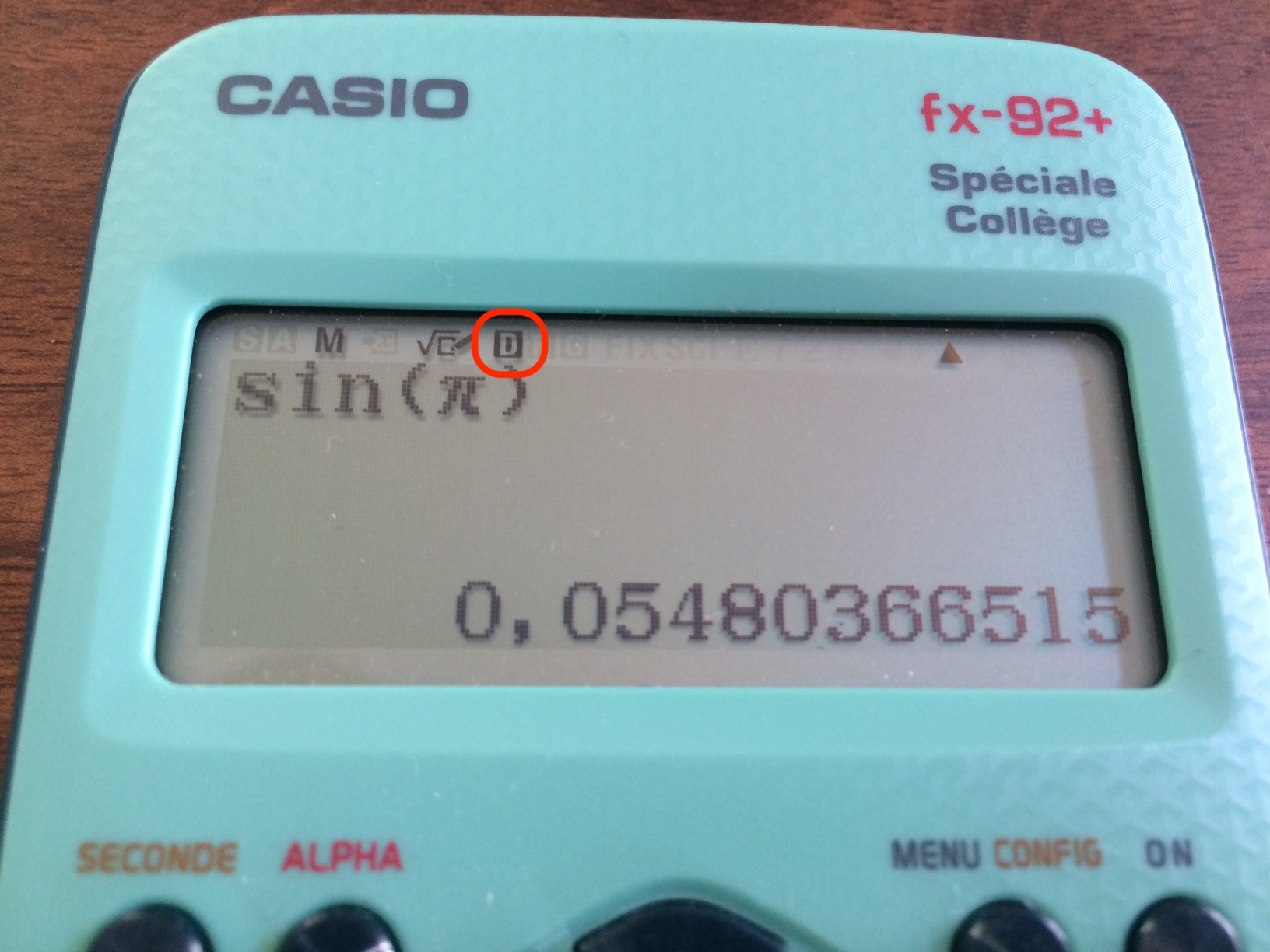 What, sin(π) isn't 0? Oh, yes, there is that tiny "D" for "degrees" at the top of the screen. This is not what I call user-friendly.
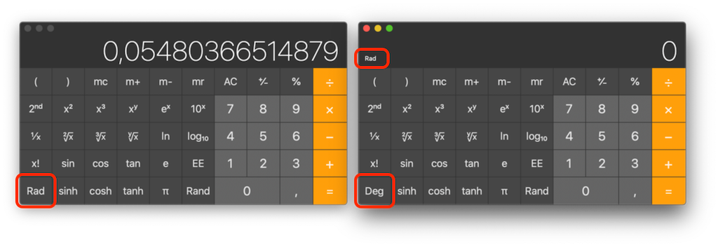 On the left: what, sin(π) isn't 0? But "Rad" is displayed… Oh yes, this isn't the current mode, this is the key to *change* between modes. Right: now I have both "Deg" and "Rad" on the same screen. This is not user-friendly… this is plain stupid.
We all know that young students don't know radians and only understand degrees. But instead of helping them, calculators lead them down the wrong path. They make them believe that degrees are natural, while they really aren't, the degree is an artificial unit. In my opinion, degrees should always be explicit.
Chalk solutions for presentation
Now that I've explained many failures associated with the typical software calculator design, I can summarize them all in one hard-to-swallow sentence: Some much needed features are difficult to implement and require a large amount of work. If these features are not available, this is because nobody really cares, and there are few pre-existing parts to build upon.
A typical example would be pretty-print
. Rendering mathematical expressions on a computer remains a strong topic in 2021. You may remember the old Microsoft Office Equation editor, so old there is a theory that Microsoft lost the source code. That was a poor tool, but with no real alternative. It has only been replaced in 2018, and Apple waited until 2018 to introduce such a tool in iWork.
Using a TeX engine is good for documents, unfortunately there are very few tools designed to manage short mathematical expressions that you could copy/paste/modify anywhere. Even LaTeXiT (an excellent tool developed by none other than yours truly) has to be a standalone application, because there is no alternative.
The MathML standard has always been looked down on, which is illustrated by the fact that it has even been dropped from Google Chrome.
Remember when I said the Google search engine was a better calculator than many others and what a shame that was? Considering that the best equation rendering engines are probably JavaScript web tools, I'd tell the joke is turning into a running gag. Why can't computers have such systemwide tools, working offline, as part of their standard configuration? Something based on SVG and MathML for instance, and that would not require a JavaScript engine for rendering?
Compactness
By design, Chalk doesn't use a virtual keyboard, but a text field. The results are rendered in a scrollable window that allows high minimization.
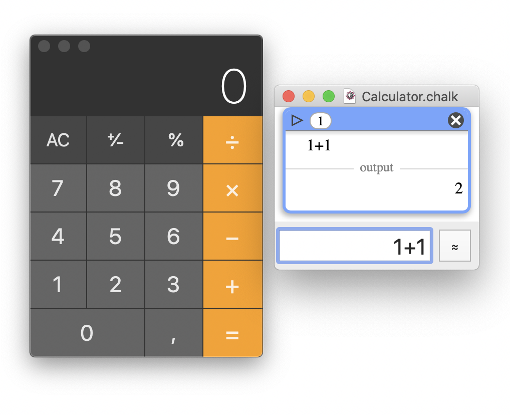 macOS Calculator vs. Chalk minimized window
Thanks to retractable panels, Chalk can reveal advanced features while remaining fairly compact.
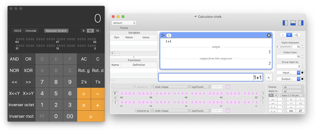 macOS advanced Calculator vs. Chalk advanced features windows (which offers more features)
Even if Chalk's design avoids the necessity of opening multiple windows (most of the time), who am I to decide that the user doesn't need them? So multiple Chalk windows can be open.
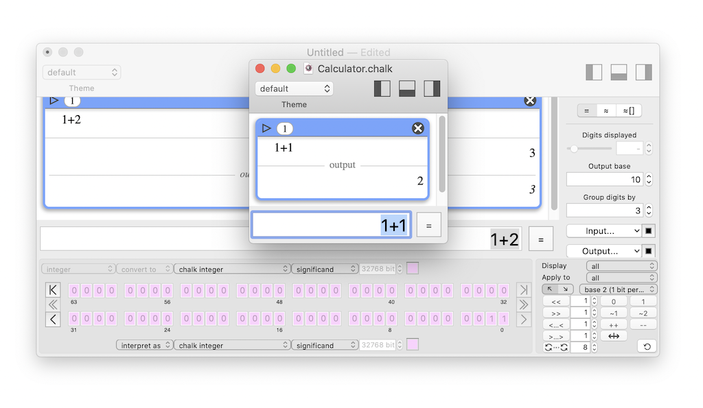 The user can open several Chalk instances, each one working as a standalone document.
Input
Once validated, each expression is displayed in the result view, which is scrollable. This simple solution offers:
- compactness
- full expression input, smart syntax error handling, and active error control
- history
Within a reduced space, Chalk supports text input of full expression, easy typing error fix, and history.
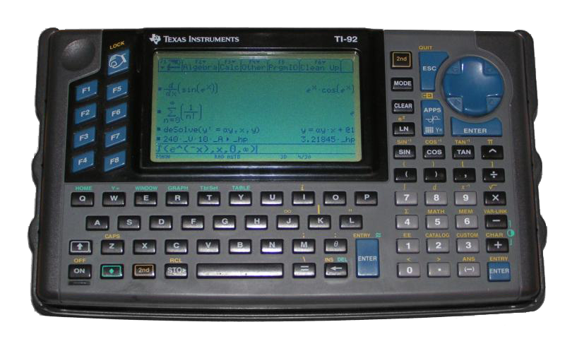 This is the behavior of the TI-92, one of my favorite calculators. And yes, it inspired me when I designed Chalk.
History
By design, Chalk's scrollable results view provides a natural history. But there is a little more to say! What is the expected behavior when you close and reopen a software calculator? Or when you open multiple instances? Chalk behaves as follows.
- When you launch Chalk, you open the
main
Calculator which includes a full history of previous computations (based on an auto-saved document that can be cleared at any time, of course). - When you close that window, but do not quit the software, the document is just hidden, so that recalling it does not involve any expensive task.
Un-hiding
is just instantaneous. - If you open a new instance, it behaves as a new document which does not feature auto-save but can be saved explicitly to a dedicated standalone file.
 Here, you can see two Chalk windows: the "Calculator.chalk" window, which is the auto-saved document of the "main" Calculator, and an "Untitled" window, which is not auto-saved and can be explicitly saved to a dedicated file.
Symbol names
Until here, I deliberately omitted an important detail. Without a virtual keyboard, you are bound to learn the expected syntax of the calculator. And for simple operations it may feel like overkill.
For instance, if you have never used a programming language, there are few chances that you know that sqrt()
and cbrt()
are instructions used to compute square and cube roots, respectively. So, how do you guess the correct instruction for an operation you usually input using a symbol?
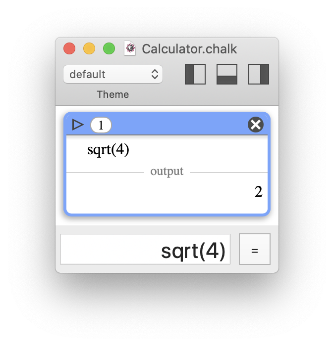 "Text only" means that you must know the instruction corresponding to a symbol, such as sqrt() ("square root") for √, which is not an easy guess…
This is perhaps the only point for which I don't have a proper solution, and I see it as an acceptable inconvenience. Indeed, it appears that sqrt()
and cbrt()
may be the only common symbols that are not obvious to most users. Power
is widely recognized as ^
, and even if you don't know that e is an exponential function, ex can be written as e^x as long as e is the expected constant. Apart from that… not much to say.
I considered using a symbol palette tool
, but it would have been fairly empty, redundant with the quick documentation, and not very coherent anyway.
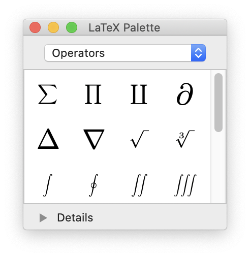 A symbol palette, such as that of LaTeXiT (shown here), would not have been relevant for a calculator like Chalk – it would only be useful for a limited number of operators.
Instead, I designed the documentation to make it as easy as possible to find the square/cube root at a glance.
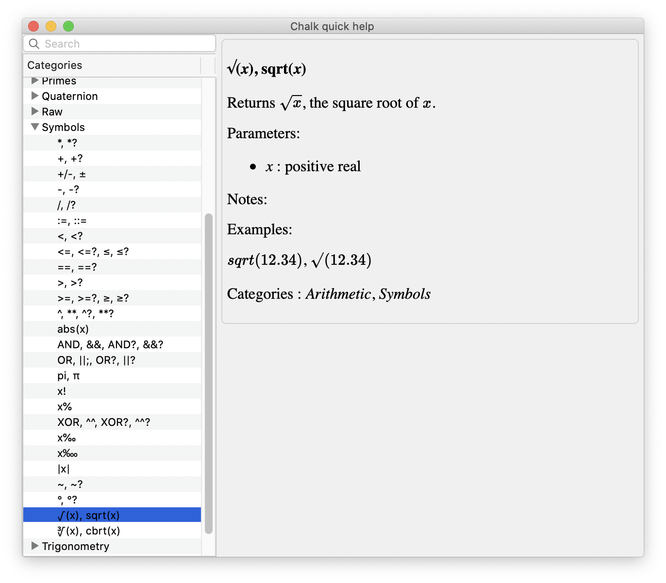 It doesn't take long to find the square and cube roots in the list of symbols, and the corresponding instructions, sqrt() and cbrt(), are clearly stated aside.
To be comprehensive, the input parser also supports the Unicode symbols √ and ∛. This way, the documentation is accurate, and you can really copy/paste these symbols in an expression, with the expected result!
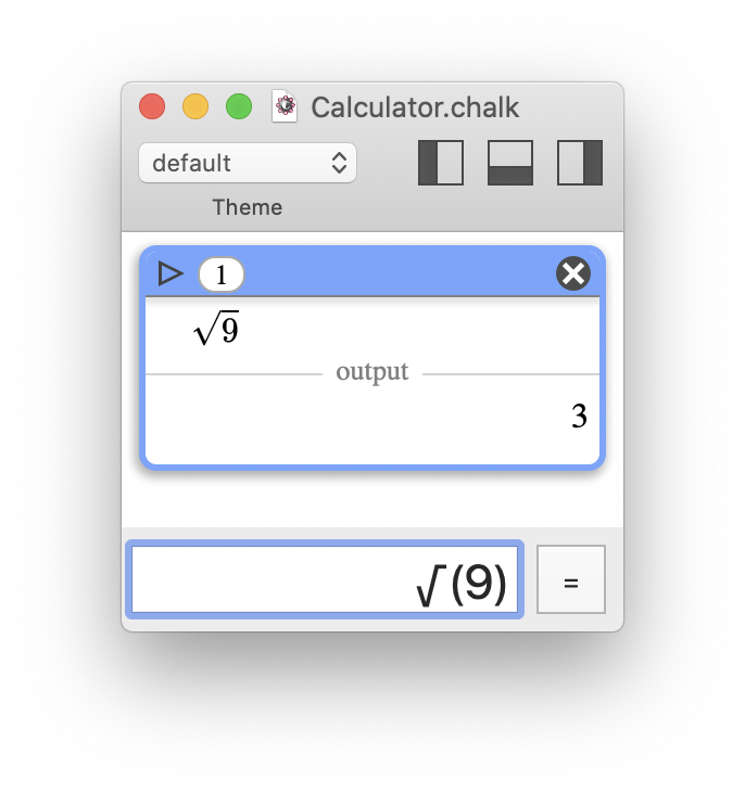 It is legal in Chalk to use the Unicode symbols √ or ∛.
For constants like π, the problem appears less critical, since many people will be used to type PI() in their spreadsheet software. For convenience, in Chalk, the constant pi
and the Unicode character π are both supported.
A side question is: should Chalk use localized instructions for symbols? For example, SQRT() is RACINE() in the French version of MS Excel. In my opinion, this is bad practice, because this leads to a lack of homogeneity, exposing users speaking different languages to different documentation, and it makes it more difficult to share information over the web.
Pretty-print
Using an equation rendering engine for math expressions is One of Chalk's major features, and one of the most complex to program. Sure, I didn't program it myself, but I had to make it work flawlessly in the context of a dynamic document with user interactions. It isn't only about rendering! Please refer to the section Under the hood to find out more details.
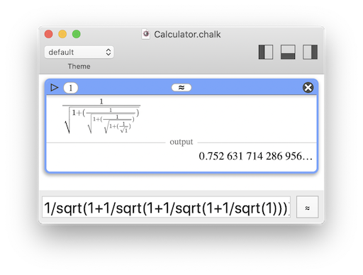
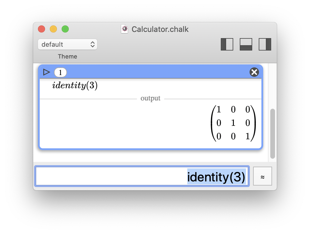
Another key point was to enable both pretty-print and plain text to allow copy/paste of expressions as strings. In Chalk, I made this possible with an (unobtrusive) switch button, allowing the user to select the type of rendering.
Chalk default rendering is pretty-print, but you can switch to plain text anytime you like. Plus, when you select an expression, the plain text version is carried over to the input field.
No "modes"
In Chalk, degrees always have to be explicit using the °
symbol, which is just an alias for × π/180
. Okay, students may still forget that and make mistakes with trigonometric functions, but I think it's better since the error has a real meaning and encourages them to learn trigonometry.
Additionally, since °
is an operator, you can use syntax like sin( (180/2)° ) for instance; it makes sense.
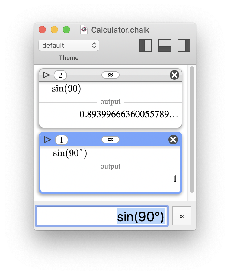 By default, Chalk uses radians, and the "°" symbol must be used to input angles in degrees.
Skeuomorphism
I've already mentioned irrelevant skeuomorphism, and criticized expressed my thoughts on the subject. But just for fun, because it was very easy to implement, I decided to provide themes for Chalk's rendering. It doesn't change the layout, just the fonts, the colors, and the background texture. I think the Blackboard
theme with its chalk-like font is a good compromise between simplicity and aesthetics.
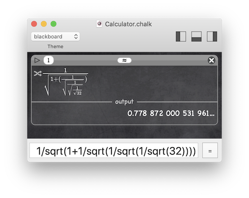 What do you think of the "Blackboard" theme?
Under the hood
This section is intended for developers and aims to provide more details regarding the implementation.
- The rendering engine is MathJax, which is great… but is a JavaScript framework requiring a browser or node.js. I'm not a big fan of JavaScript, and even less when you have to debug it once bridged with a
regular
programming language (Objective-C for Chalk). Ouch! - At least, using a JavaScript engine has a few perks. It led me to use a WebView to host it, solving the scrollable history problem.
- The trade-off is that I had to use JavaScript to code each and every interaction with the user (switch button, folding, annotations, selection, numbering…), and that was a real pain.
- Another perk is that with the WebView, a full
theme
is a simple CSS stylesheet. I think CSS is terrible (don't hold it against me), but it does the job. - One thing that worries me is the sustainability of the WebView component. The long-standing WebView of Cocoa will be deprecated by WKWebView. But WKWebView is not as polished on macOS as it is on iOS. A good example: it doesn't display scrollbars… and that's a real problem! Not to mention that all web technologies are rather fragile and may be deprecated very quickly. They don't simply
stop evolving
(which would be tolerable), but rather outrageouslystop working
. Did you know that you can't even navigate Stack Overflow with an old Safari browser and macOS 10.6? - I didn't try to limit the size of Chalk's history of computations. As long as the WebView can render it smoothly, you can add items. The difficult part was to link the history to a database to lazy fetch only what is needed and benefit from better startup times. I'm in love with SQLite, but native macOS development led me to use Core Data instead. The fact that it's based on SQLite is unfortunately not a guarantee of quality. Core Data is one of Apple's worst APIs, I spent countless hours trying to make it work as I intended. It is plagued with bugs, incoherent behaviors, incredibly hard patterns for simple things… With some luck, I'll never have to use it again… ever.
- I couldn't use an existing input expression parsing engine, because Chalk has many specificities that I needed to handle myself. However, I was very excited to create my very first lexer/parser, something I did not get a chance to do as part of my IT education. I decided to use the Lemon meta-generator, and I think it was the right choice. Did I mention how good SQLite is?
<grumbling>Maybe this entire section on graphical interface did not capture your interest. After all it doesn't concern numerical things. But it's something I needed to talk about. Really… As a relief… I was forced to use some of the programming technologies I hate the most: Web, CSS, JavaScript, and Core Data. Except Lemon, all these technologies, blended together, were a huge pain. The first betas of Chalk were pretty good on everything relating to the computation engine, but it took me months… MONTHS to get the interface to work the way I wanted to. I wouldn't wish that on anyone.
In some way, this illustrates my point that "desktop calculators are bad because programmers are lazy". Lazy may not be the best term… "afraid" or "not willing to lose their soul for a mere calculator" would be more accurate.</grumbling>
Compute engines: Software calculators are wrong about their limitations.
Defining the limits of calculators
Large numbers: a semantic misunderstanding
Let me ask you a simple question: what is the largest number calculators should handle?
Don't answer, it's a trap! The question is actually misleading. Many things should be clarified before you attempt to offer any kind of answer. Like what is a large number
, or what would that mean not to handle it
?
Defining a large number is not irrelevant, but of limited interest for a numerical software calculator (by opposition to a formal computation software). Large numbers do exist, but you should only manipulate this concept theoretically, not numerically. See Knuth's up-arrow notation and Graham's number for instance.
In the scope of calculators, an intuitive definition of a large number would be: any number that can be written using a scientific notation with an exponent because writing all the digits offers no substantial advantage.
For instance, let's assume that you need to compute an expression that contains 1e99. Do you want your calculator to display 1e99, or the exact digits
1000000000000000000000000000000000000000000000000000000000000000000000000000000000000000000000000000?
The same question applies to small numbers. Would you prefer to read 1-100 or the exact digits
0.0000000000000000000000000000000000000000000000000000000000000000000000000000000000000000000000000001?
Mathematicians will tell you that both values are identical, so there is no sense in asking which one you want to use.
True, but my examples were purposely biased.
If you compute 299, do you want your calculator to display a short 6.3<some digits here>e29 or the exact digits
633825300114114700748351602688?
Again, the question applies to small numbers. For 2-99, do you prefer to read a short 1.5<some digits here>e-30 or the exact digits
1.577721810442023610823457130565572459346412870218046009540557861328125e-30?
But these examples are still biased, these values (obviously) have a finite representation, making you believe it is only a matter of how much space you are willing to use.
But where should your calculator stop when you compute √2?
- 1.414;
- 1.41421356237309504880168872420969807856967187537694807317667973799073247846210704;
- 1.41421356237309504880168872420969807856967187537694807317667973799073247846210703885038753432764157273501384623091229702492483605585073721264412149709994;
- or even more digits?
We can now reframe our initial question as follows: how many digits should calculators handle?
Wait! Don't answer, it's another trap.
Once again, it's difficult to provide a definitive answer because there are no less than 4 different notions intertwined: number representation (storage), bit precision, bit accuracy, and number writing.
- Number representation: when an integer is too large, switching to a floating-point storage makes sense (with a loss of precision).
- Bit precision: a floating-point representation cannot represent all numbers, but the more bits you use, the wider the range of values you can represent.
- Bit accuracy: no matter how high the bit precision is, the precision remains limited and small errors can accumulate after several operations, resulting in garbage bits. Bit accuracy represents how many bits are not garbage.
- Number writing:
- If a large number of bits hold an exact value, you may want all the digits.
- If a large number of bits hold an exact value, a scientific notation with a reduced number of digits may be enough.
- If the value is not exact, you may have garbage bits and should avoid writing digits out of them.
Having said that, it appears that the limits of calculators are not only about the number of bits they use in their representations, they also involve decisions regarding these representations, how they display them and let the user customize the display.
Representation switching
With pocket calculators, the compromise between accuracy and usability is usually built in the following way (taking into account limited bit precision):
- Use integers when numbers are integers fitting within the bit precision; long numbers can be displayed on the calculator's screen.
- Convert overflowing integers to floating-point representation.
- Use fractions when decimals can be expressed as fractions where both numerators and denominators fit within the bit precision.
- Propagate formal values (like √2) in expressions, when possible.
- Supply both
=
and≈
to keep formal values or force approximation.
And this is not bad at all! Now, let's compare it with representation switching in common software calculators (caution, irony will be used!).
- Use integers when numbers are integers fitting within the bit precision and convert overflowing integers to floating-point representation.
Software calculators behavior is more or less the same as that of pocket calculators; what a pity!- When mimicking digital LCD displays, there is no space for large numbers… unless you start adjusting the font size. I wish I was joking, but try macOS Calculator!
- Modern computers can handle millions of digits in a breath. So why is the maximal integer comparable to that of pocket calculators? It should be orders of magnitude higher! Yes, this would require an adapted user interface, one with a scrollable screen…
- Use fractions when decimals can be expressed as fractions where both numerators and denominators fit within the bit precision.
What are fractions? Is this something software calculators should handle? - Propagate formal values (like √2) in expressions, when possible.
What is a formal value? Is it really useful for scientific applications? - Supply both
=
and≈
to keep formal values or force approximation.
Do you mean selecting the graphical interface,standard
orscientific
? Why would you want to know if a number is exact?
As you can see, once again, software calculators are far behind dedicated pocket calculators. And they follow the worst possible path… Instead of breaking historical limitations that are no more prominent, they drop features and do not even perform as well as their pocket counterparts!
In addition, when it comes to integer to floating-point representation switching, there is still a mistake shared by both pocket and software calculators: the number of bits of the maximum integer should be known, or at least reaching this limit should be signaled in some way.
Otherwise, the result displayed could be misleading.
- When you compute 339 (the largest power of 3 lower than 263, which is a frequent bit limit for signed integers):
you get 4.052555153018976e18 instead of 4052555153018976267, which makes you think that the result is a floating-point number. - When you divide the result by 205891132094649 (330):
you get precisely 19683 (39), which is the correct answer.
In this example, representation switching did not occur: 4.052555153018976e18 is simply a scientific notation that does not represent the full underlying precision.
If this result were a floating-point number with the same bit size as the corresponding integer, the bits used to store the exponent should induce a loss of precision in the significant part. Therefore, the result of the division would not be exactly 19683.
This can be easily checked. Instead of computing 339/205891132094649, try computing 4.052555153018976e18/205891132094649. The result should be ~19682.9999999999987, not 19683.
To conclude this section, here is a summary of the issues related to representation switching that I identified.
- The bit limit for integers should be known (an issue shared by both pocket and software calculators).
- The bit limit for integers should be much higher (seriously, computers can handle massive numbers of bits).
- The event of overflowing an integer should be signaled; number writing is not a reliable hint (an issue shared by both pocket and software calculators).
- Fractions and formal values should be propagated as long as possible to prevent a premature loss of precision (shame on software calculators for ignoring them).
- The bit limit for floating-point numbers should also be much higher (need I restate that computers can handle massive numbers of bits?).
- Having two different buttons to get a value (
=
to get the most accurate value, even if it still relies on fractions and formal values, and≈
to force an estimation) is a great feature of pocket calculators (shame on software calculators for ignoring that).
Number writing
As stated in the previous section, even an exact integer can be displayed with a scientific notation, losing some significant digits for the sake of readability or common use. This is not a real problem in itself. According to me, the real issue here is the fact that the user has no choice.
- It should be easy to let the user select the number of significant digits to display.
- By easy, I do not mean going into the preferences menu and changing a
setDisplayPrecision()
function. Easy means something you can do on the fly, in real time. - Moreover, there should be no possible confusion between the
bit precision
used in computation and thebit precision
used for display. These must be handled clearly and separately. - Indeed, changing the
bit precision
for display should not trigger a new computation. It is only a question of changing the way the bits are rendered as digits on the screen, and should not be an expensive action (in terms of computation).
- By easy, I do not mean going into the preferences menu and changing a
- There should be a visual cue indicating the displayed number is not exact.
In the previous section, I mentioned that 4.052555153018976e18 obtained by computing 339 was not the same as 4.052555153018976e18 typed manually. Same writing, different values!
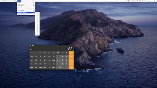 I wish this was a joke! macOS Calculator really uses a drop-down menu to set "Decimal places". I will let you judge how to rank this on a scale from "I don't understand numbers" to "I don't care about practicality".
Supported math
Here are some common math features supported by most pocket calculators:
- fractions
- formal values (such as √2)
- complex numbers (not always)
- matrices (not always)
Here are some common math features supported by most software calculators:
- none
- oh wait, bases 2, 10 and 16 (to please programmers, but only for integers when using the
programmer profile
)
I don't have much to add, except what starts emerging as a motto: shame on software calculators
.
Once again, just because a software calculator is meant as a light tool doesn't mean the host computer cannot run advanced algorithms. That's what computers are made for!
Common bit limits
Without surprise, most software calculators use 64 bits to store numbers, because it's the native integer size on modern CPUs. Signed integers can be represented up to 263-1, while signed floating-point numbers use 11 bits for the exponent and 53(=52+1) bits for precision (IEEE754 encoding with one implicit bit).
With the infamous programmer profile
, the 64-bit limit is only enforced with integers.
This raises at least two questions:
- Why not more?
- What if I want to know more about IEEE754, or more generally deal with bits?
These are discussed in the following section.
To be fair, macOS and Windows software calculators have made good progress in recent years. See The results of standard software calculators are (sometimes) surprisingly good section further below.
Binary representations
Software calculators almost always use native 64-bit numbers (integer or double
for floating-point), because they are much easier to manipulate than arbitrary large numbers.
Nevertheless, they also offer a programmer profile
(with a dedicated interface layout), admitting that some people may need to work at the bit level. So, why not being comprehensive about bit representation?
Given a pool of storage bits, there are 2 different operations:
- encoding a value with the bits, matching a standard
- interpreting (decoding) a value from the bits, matching a standard
The interpretation
step is always missing in software calculators, just as if they forgot what programmers go through. Yes, we sometimes need to interpret 32 bits as floats, or 4 unsigned chars. Sticking to 64-bit signed integers is just overly restrictive.
There are many use cases for bit-level granularity tools, and most of the time, software calculators are not practical enough to be useful.
Please note that this time, pocket calculators are inferior to software calculators: they do not offer any kind of bitwise interface. This is just too advanced for pocket calculators and their target audience. They are not designed for developers, because developers are not supposed to be so disappointed in software calculators that they resort to using a Casio/TI calculator alongside their computer boasting 16 GB of RAM, a 3 GHz, 8 threads CPU, and running a multitask 64-bit OS.
Chalk solutions for the compute engine
Large numbers (and bit limits)
There are many existing libraries designed to cope with arbitrary large integers; the number of bits is only limited by the amount of memory that can be allocated. Assuming unlimited RAM and a 64-bit OS with no restrictions regarding the maximum amount of memory that can be allocated, the theoretical limit is 2264-1-1, which is slightly bigger than 264.
Chalk is also using a dedicated API for floating-point numbers. The significand part can have as many bits as an integer, but the exponent part is a fixed size field. Chalk's exponent is in the -4611686018427387903 to 4611686018427387903 (-262 to 262) range. This doesn't mean a floating-point number cannot exceed 262! Instead, it will overflow (be considered as infinity) for a binary exponent greater than 262 (which is approximately a decimal exponent of 1388255822130839282), and underflow (be considered as 0) for a negative exponent lower than -262. Don't worry if you had to read the last sentence twice, numerical representations can be hard to understand.
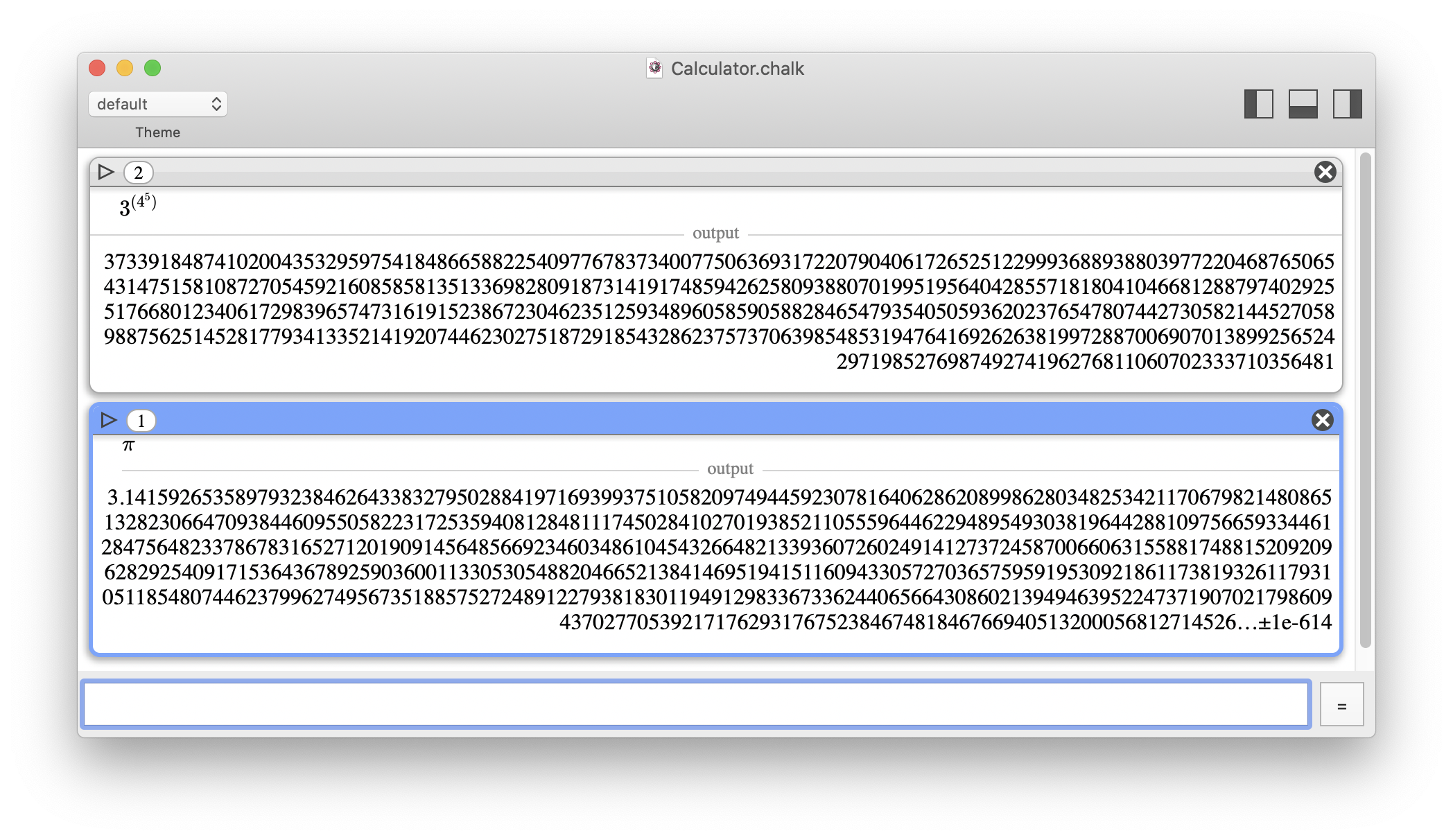 In Chalk, the number of usable bits has no practical limit.
Representation switching
When an integer is too large to be represented exactly (in a given configuration), automatically switching to a floating-point representation is just one option. You can alternatively warn the user about the integer overflow, and let them decide what to do.
- Chalk could automatically expand bit storage of integers to avoid overflow, but would it be reasonable? Most of the time, large integers result from exploding numerical values. It is therefore preferable to stop the computation rather than waiting a long time to get a value that is not really expected. If the user really wants to dedicate computation time and wait for the result, this must be explicit (by letting the user adjust the bit storage size).
When an integer overflows with the current bit limit settings, an event is raised. In this example, I chose to increase the bit precision (rather than computing an approximate value).
- Switching to floating-point representation is also an explicit choice, using the
approximation
mode (≈
) instead of theexact
mode (=
). The user acknowledges that he accepts approximations.
At any time, the user can choose to use the "approximation" mode instead of the "exact" mode. Here, "approximation" is not the default mode and is only applied to the selected computation. The user can directly call the "approximation" mode by hitting Alt+= (⌥+=). A third mode ("≈[]") is visible, and will be explained further below.
Number writing
Chalk is very versatile when it comes to number writing. Without further computing, the user can apply live changes to:
- customize the number of digits displayed (limited by the maximum of significand digits supported by the value)
- customize the output base (from 2 to 62)
- group digits to help readability
Once a computation has been done, the number of displayed digits can be adapted (limited by the number of bits used for precision during the computation). It does not trigger any new computation, this is just a presentation option.
Chalk offers even more features, related to approximation flags, that are detailed below in the Numerical truth section.
Supported math
From the beginning, Chalk has been designed to handle advanced math features (for a software calculator):
- fractions
- complex numbers; supported using the built-in constant i
- quaternions; complex are just a sub-case of quaternions using the built-in constants i, j, and k
- matrices
- any base between 2 and 62, for both integers and floating-point numbers (a dedicated syntax is used to specify the base on input)
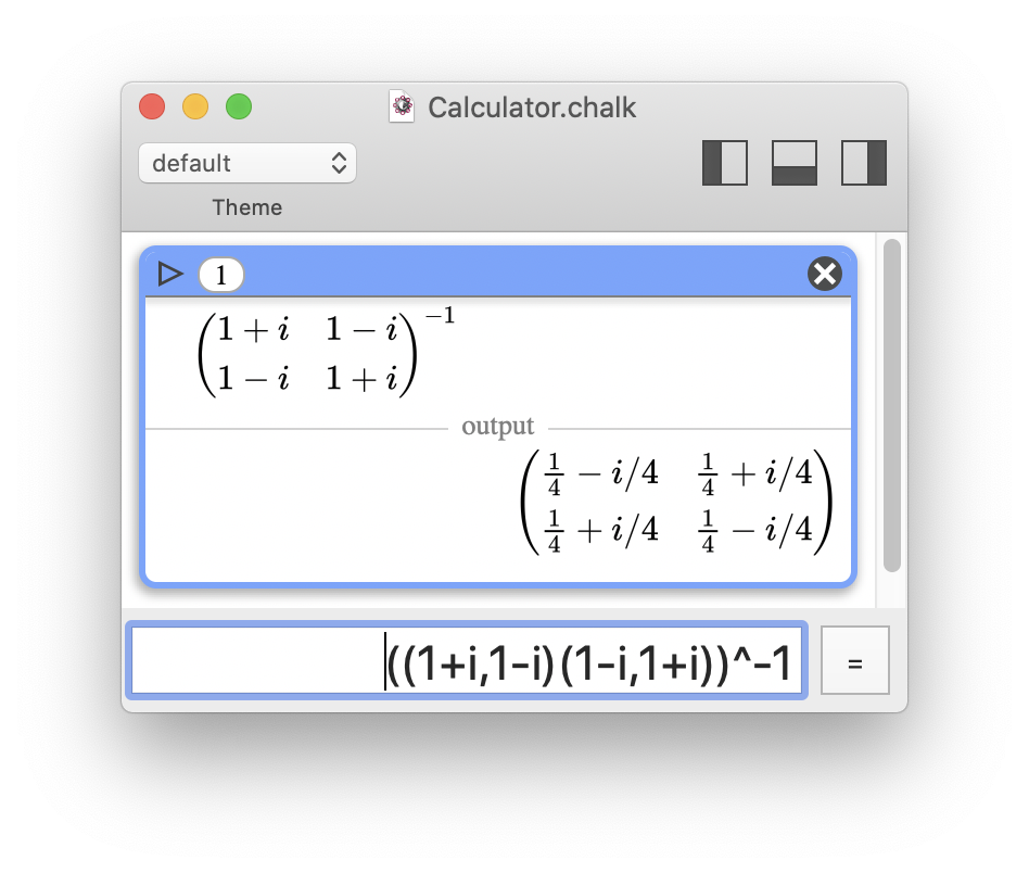 Exact inversion of a complex matrix
Chalk also benefits from a subtle addition when handling approximations.
An ellipsis (…
) is used to clearly indicate that the displayed value is an approximation. And this does not only relate to integer vs. floating-point!
- The user will know when rounding happens as the result of a reduced number of displayed digits.
- Some floating-point values are exact (sum of negative powers of two), while others are not.
Chalk knows when a value is exact, and the user will be clearly informed. - If
…
is used on input of a decimal number, this number will not be converted to a fraction.
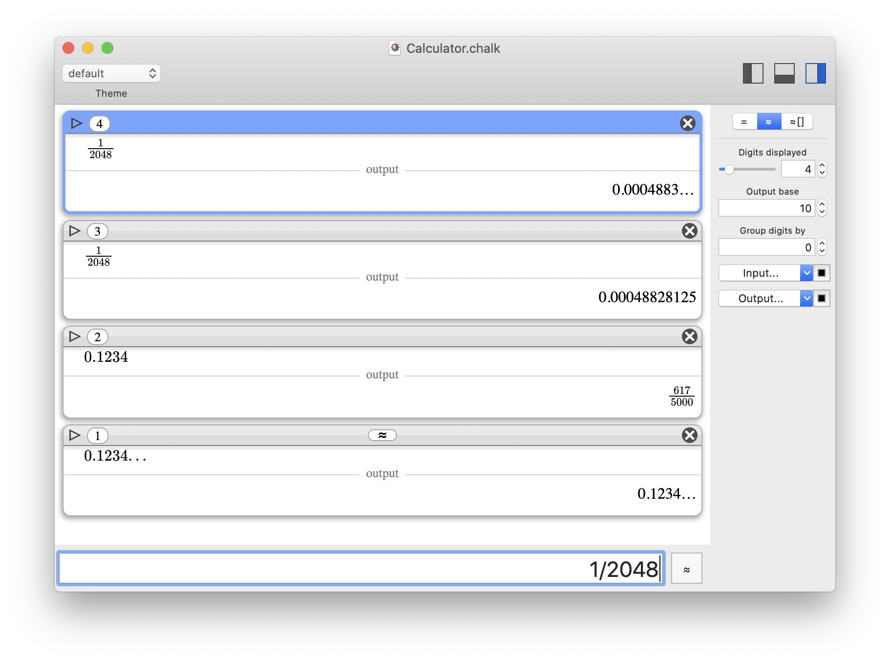 Different usages of "…" are illustrated. In the first one, the number of digits displayed has been decreased, and rounding occurred.
Supporting bases is not that difficult since the GMP library can already do all the work. Once again, the main problems are found in the interactions with the user. To address these, Chalk adopts a unified vision of the common prefixes/suffixes used to define bases (0b for base 2 or binary, 0o for base 8 or octal, 0x for base 16 or hexadecimal).
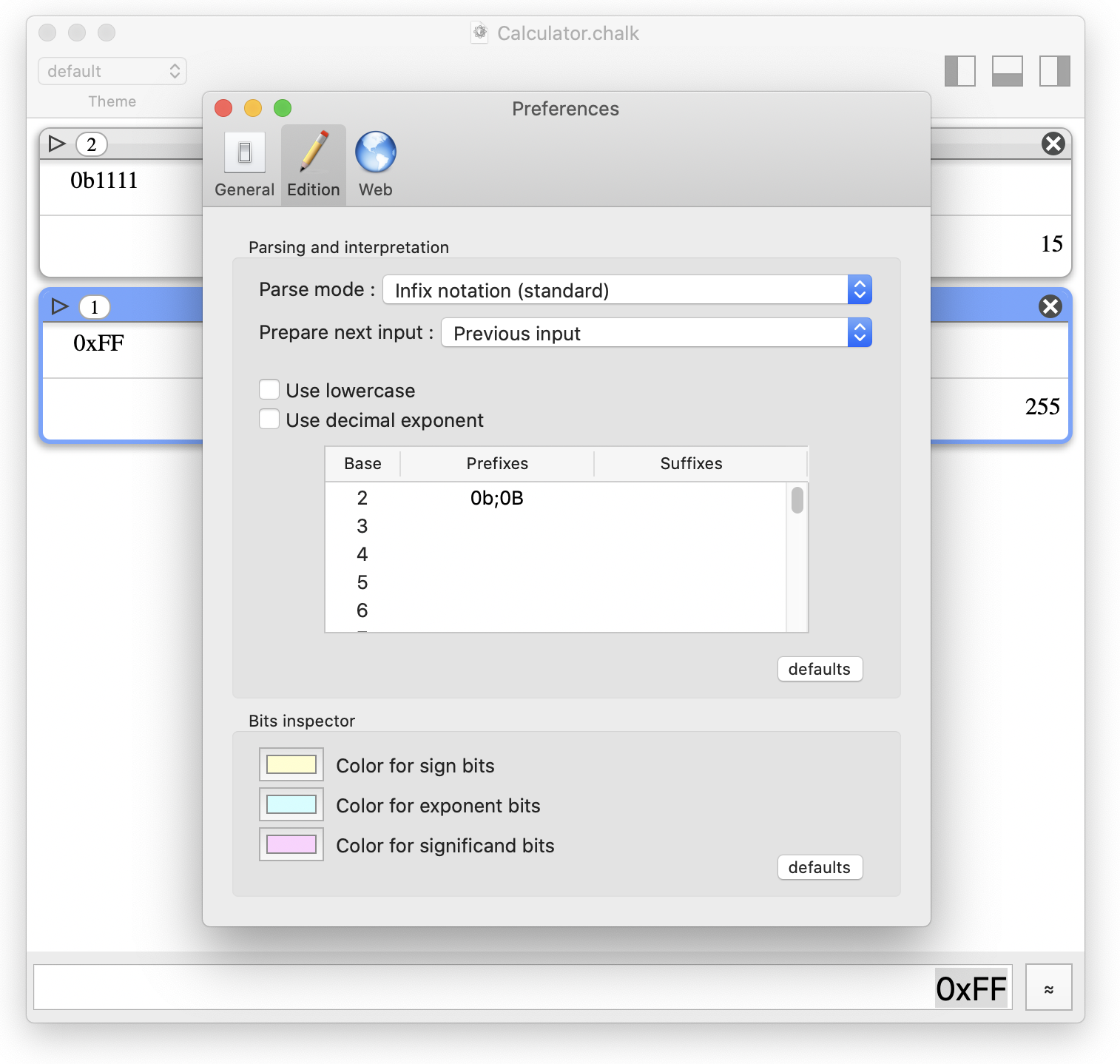 Chalk comes with a unified tool to define well-know prefixes or suffixes to denote a particular base.
Binary representations
Chalk includes a bit manipulator. It really should be called a digit manipulator
since all bases are supported, but this might have been misleading or confusing for some users.
Chalk's bit/digit manipulator has several usages:
- bit-level representation to see how a number is encoded
- bit-level operations (flip, shift, roll, complements, etc.)
- switch representations (convert or interpret) of integers, standard IEE754 floating-points, native Chalk representations, for deep understanding of bit fields
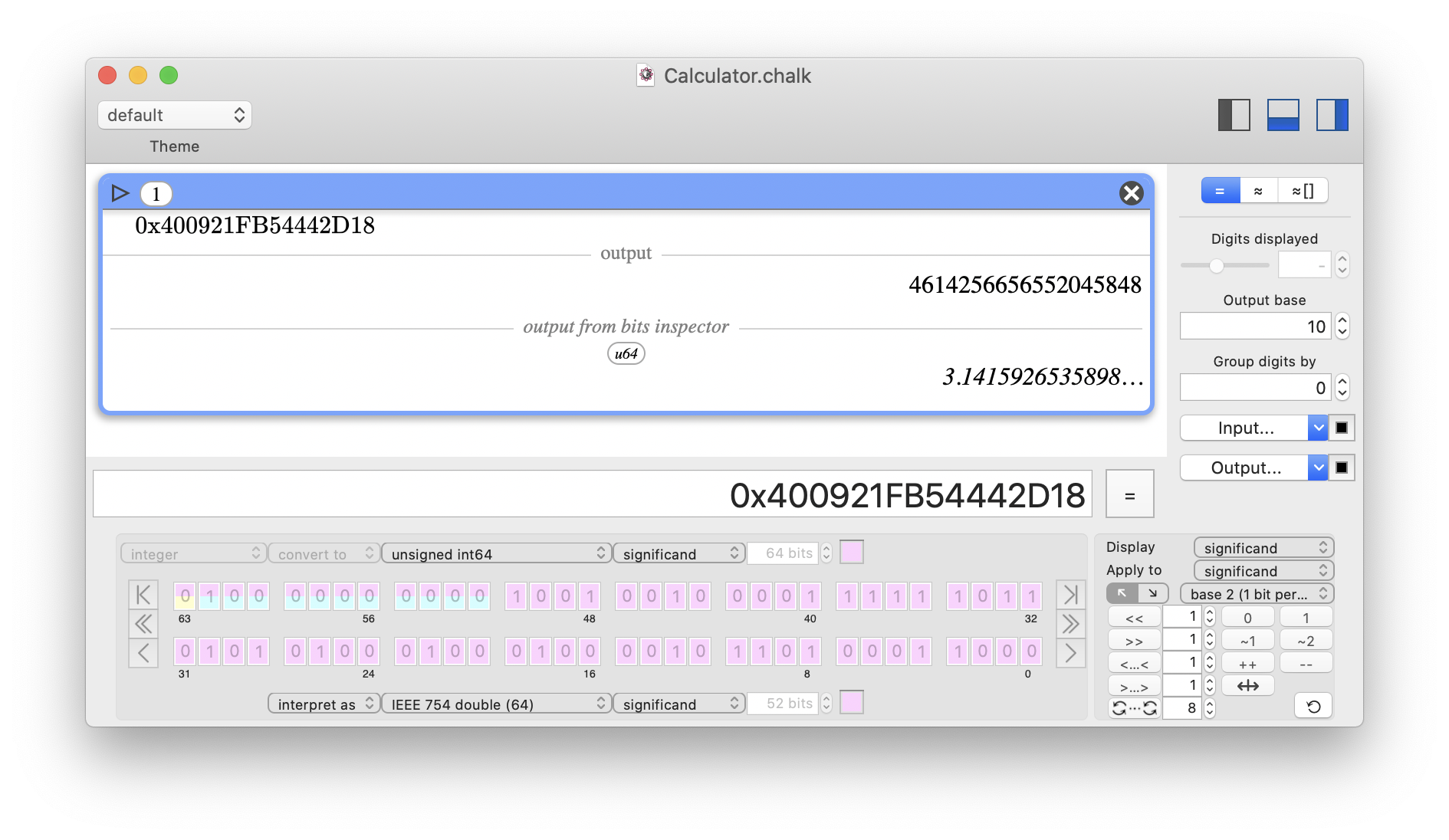 The 64-bit integer 400921FB54442D18 (in base 16, denoted by the prefix 0x) can be interpreted as a standard IEEE754 double with the value π. Please note how the yellow/blue/pink colors indicate where the sign/exponent/significand bit fields are encoded.
Under the hood
This section is intended for developers and aims to provide more details regarding the implementation.
- For arbitrary large integers, Chalk relies on the GMP library.
- For arbitrary large floating-points numbers, GMP didn't provide sufficient precision and accuracy, so Chalk relies on the MPFR library, which is built upon GMP. As you will see in the Numerical truth section, Chalk uses additional layers of libraries on top of MPFR.
- For some specific mathematical functions, Chalk also relies on the embedded MPFR-like library ARB, which requires FLINT.
- Numerical representation of floating-points is difficult by nature. You end up reading articles like What Every Computer Scientist Should Know About Floating-Point Arithmetic and understand subnormal numbers.
- Implementing quaternions was fun, especially dealing with unusual grammar choices. Since the multiplication of quaternions is not commutative, a
fraction
of quaternions is ill-defined. Indeed, writing q1/q2 can mean either q1*q2-1 or q2-1*q1. With Chalk's current implementation, I went for the more intuitive choice (numerator first), but it doesn't seem to be a consensus. - Writing the
bit manipulator
was a real nightmare; this tool required a lot of code to handle all the possible conversion/interpretation between all supported representations. GMP does not intrinsically use a IEE754-like representation for floating-point numbers: it has no explicit bit sign, least significant bits are encoded first, the most significant bit is not implicit, and padding occurs… It is very difficult to write good and robust code while trying to pick up and move bit ranges here and there. But I think you will see it as a valuable tool (and appreciate all the hard work). - Simply printing a number as a string of characters turned out as another unreasonably difficult feature to build. Even with MPFR native functions for this task, Chalk's advanced usage of the ellipsis character and its subtle behaviors regarding exponents made it incredibly more complex than it first looked. But I think it was worth the pain.
- Foreseeing a problem doesn't mean you will find an elegant solution (which can be a little disappointing…). Think of all supported bases and the scientific notation with an exponent
e
. There is obviously a clash: the exponent charactere
is a validdigit
starting from base 15 (10 digits [0–9] and 5 characters [A-E]), while the characterp
is a C++-standard notation when dealing with base 16! Not a comprehensive solution… Therefore, I had to introduce an optional disambiguation system (using the#
character) to flag#e
and#p
as exponents rather than digits when the base allows them. - At the time of writing, Chalk does not (yet) support formal values. This is work in-progress as I had to build everything else first. It's well on its way, and will be a natural add-on built on Chalk's current code structure (not some kind of ugly hack).
Numerical truth: The results of software calculators are wrong.
Dear user, you read through to this point, kudos! You are finally reaching what I see as the most interesting part of this documentation (I even wonder whether I should open with this section). This section discusses how much you can trust the results given by calculators, because most of the time… they are wrong! Not by much, but still wrong. And sometimes, you just want to know and take it into account. Your calculator should not be able to fool you.
With Chalk, my goal is to show how calculators can really help. And sure, always giving a true result is one aspect; most people take this for granted… but it is not.
Computation inaccuracy
Obviously, a limited number of bits cannot encode every decimal number. Even finite numbers cannot fit, since we can only store sums of powers of 2 (positive or negative, shifted by a binary exponent).
This has two consequences:
- A number can be wrong as soon as stored on input.
- Significant bits will be lost during the computation, and errors will accumulate during successive computations.
Here is an example using a classical IEEE754 double
with 53 significant bits.
- Let's start with 1.234. The real value stored with 53 bits of precision is in fact equivalent to 1.2339999999999999857891452847979962825775146484375. But 53 bits means 53 digits in base 2, so after some logarithm-based math, you know this won't be more than 15 digits in base 10 (remember, macOS Calculator has a limit of 15
decimal places
). Therefore, rounding to 1.23400000000000 is correct! - Now, let's divide by 16384. Since it is a power of 2 (214), all significant bits are kept: this is just a modification of the binary exponent. The resulting value is 0.000075317382812499999132638262011596452794037759304046630859375.
- Let's add 1. This time, the 14 lowest significant bits are lost since we must shift the exponent back to 0. The resulting value is now equivalent to 1.0000753173828125230926389122032560408115386962890625.
- To finish, let's revert these operations: subtract 1, then multiply by 16384. Because of the lost bits, the final value is something like 1.234000000000378. The inaccuracy has been carried over into the 15 significant digits.
At first sight, it isn't so bad since you can still round to a few digits. But once it's too late, rounding isn't helping.
You want an example? Try this:
- sin(exp(35)); correct result: -0.152736139189224…; macOS Calculator result: -0.152736139189224
- sin(exp(36)); correct result: -0.980595232116246…; macOS Calculator result: -0.999556248220361
- sin(exp(37)); correct result: -0.700989599924469…; macOS Calculator result: 0.94153231374593
Of course, you do not compute such things on a daily basis. But this nifty example clearly shows there is no point in guessing when digits start to be wrong.
The fundamental issue is not the inaccuracy in itself. No matter how many bits you use, some operations will always cause a loss of accuracy. The real issue is to keep track of the inaccuracy, which would allow you to know how many significant bits you really have. Therefore, the displayed value must not only ignore the extra bits, but also let you know how large the error might be! This is related to both propagation of uncertainty and rounding modes of operations (not values), which gives reliable bounds for the result. Ultimately, you reach interval arithmetic.
There isn't much more to say. Either you perform a vast amount of extra work to propagate inaccuracy, or you don't. Chalk does, since it's the only way to guarantee true results.
Displaying inaccuracy
Once the software is smart enough to handle computation inaccuracy, the next step is to reflect this inaccuracy in the displayed value without bothering the user. This can be done implicitly or explicitly.
Implicitly
means tracking the inaccuracy without showing it. The inaccuracy is simply reflected by the fact that you will get fewer digits than expected.
Indeed, for a given storage size (bit precision), the number of reliable digits will vary depending on the operations computed. The motto isonly display the truth, hide the rest
.Explicitly
means tracking the inaccuracy and appending additional information. This additional information could be represented in different ways:±—something—absolute
,±—something—relative
, or even a full interval [lower bound;upper bound].
There might not be a single best solution. The best option could be to adapt the representation depending on the context or even to let the user decide to use a syntax-specific feature.
The implicit mode
should be the default setting. This would have one main advantage for the user: hide information they do not want or need (avoiding visual overload at the same time).
Deliberate inaccuracy
Handling computation inaccuracy comes with a very positive side effect: you can deliberately introduce inaccuracy on input! Physicists often do that; given the result of a measure, they accept its imprecision and often propagate it as ±𝛿%. Letting the calculator handle inaccuracy can be very valuable.
The results of standard software calculators are (sometimes) surprisingly good.
While writing this documentation, I always had Chalk and macOS Calculator opened to check their behaviors. And I must say that I have sometimes been very surprised with the correctness of the results given by macOS Calculator on some difficult computations. This was somewhat disappointing (need I remind you that my goal was to show how bad macOS Calculator is), and I had to find an explanation.
- First example: the expression ((1.234/16384-1)+1)*16384 gives a correct result, 1.234.
- Second example: sin(1e127) gives a correct result, 0.241710489516468.
For the first example, my initial intuition was that macOS Calculator does not pile up
over the preceding result (you can check in the paper tape
window), but instead keeps track of the operations and restart from the beginning with the full expression. Having the full expression is a good start for early detection of simplification opportunities, like reducing +1-1 or /16384*16384.
Not very convincing, though, since this would require some advanced features that are simply not congruent with such a poor tool.
So, I next inspected macOS Calculator binary (otool -L /System/Applications/Calculator.app/Contents/MacOS/Calculator), which led me to find that it is linked to a private library (/System/Library/PrivateFrameworks/Calculate.framework), most likely dedicated to numbers. Well, well, Apple might have used a good library, handling more than 64 bits in a ridiculously weak tool. But what are the limits then?
My test with ((1.234/16384+1)-1)*16384 was a good way to control for lost bits, 16384 being 214 (i.e. 14 bits). I therefore set out to find at which power of 2 macOS Calculator would fail.
Calculator 10.15.4 can still handle 261 (2305843009213693952), but fails with 262 (4611686018427387904). This suggests that the inner storage is close to 128 bits, a common size for a decimal.
Now, what about my second example, sin(1e127)? Why does macOS Calculator give a correct result? A floating-point value requires at least 295 bits to represent 1e127 correctly, defining a sine qua non condition to compute its sinus correctly!
Since Windows Calculator is open source, and also gives a correct result for such an expression, I examined the source code to find out if there's something more.
I found in the itrans.cpp and support.cpp files that:
- sinus is computed using a Taylor series on a
ratpack
variable - for convergence, a fmod() by 2π is done before
- the 2π scaling uses a clever logscale trick,
Logscale is a quick way to tell how much extra precision is needed for scaling by 2π
To me, it seems clear they are using an adjustable-precision data type, which gives correct results in such cases.
But is it enough? While developing Chalk, I realized that hiding the precision from the user was misleading, because you are not making them aware of the limits.
Let's challenge macOS Calculator a little more. I used it to compute the following expressions:
- sin(1e127) gives a correct result, 0.241710489516468
- sin(e35) gives a correct result, -0.152736139189224
- sin(e36) gives an incorrect result, -0.999556248220361
Yet, e36 isonly
4.3x10¹⁵ which is orders of magnitude smaller than 1x10127!
I could only conclude that 1e127 is just a good decimal number, easy to represent as a decimal, but not as a standard floating-point number with a binary exponent.
This has numerous negative consequences:
- A decimal gives some privilege to base 10, which is not stupid, but a little unfair.
- Some input numbers will retain very good precision, but the results of some computations will not.
- Overall, the calculator displays a heterogeneous behavior.
All in all, these calculators are not that bad, but their unpredictable behavior is really annoying and might deceive the user. They cannot perform well and pretend to be good with well-tailored examples, to finally fail as initially expected (no offense, it's just the consequence of their limitations) the instant they face real-life scenarios. I simply can't accept this idea.
Chalk solutions for numerical truth
Displaying inaccuracy
By default, Chalk doesn't display inaccuracy. It simply indicates that the result is an approximation via the addition of an ellipsis (…
) after the last true digit. This is essential: the ellipsis always follows true digits, which means that the result is always reliable. I understand the disappointment if the precision is not sufficient enough to get a usable result, but at least it is true and does not pretend to be exact.
In worst-case scenarios, the result does not even have a single usable digit. For instance, computing sin(1e200) with inadequate precision will display 0…
, because displaying only …
could be confusing.
Chalk also offer the possibility to display the inaccuracy with the ±
symbol. To keep things simple and consistent, the inaccuracy is always displayed with the form <value>±<I>e<E>
, where:
- <value> is the best approximation.
- <I> is a single digit, rounded up to guarantee a proper uncertainty.
- <E> is the exponent of the scientific notation.
For example, computing sin(1e26) with a small precision of 64 bits will return the following result: 0.85345514800567541048…±3e-20
In some rare cases, the inaccuracy will be displayed as explicit bounds, when it cannot be seen as a regular interval centered around a value. For example, computing ln(abs(sin(1e100))) with insufficient precision will return the following result: (-∞;0]
Finally, when the bounds are not numerically valid values, NaN
(not-a-number) will be displayed.
For example, computing ln(sin(1e102)) with insufficient precision will return the following result: NaN
Here, Chalk does not know for sure whether sin(1e102) is strictly positive (while higher precision would show that sin(1e102) is actually close to 0.44).
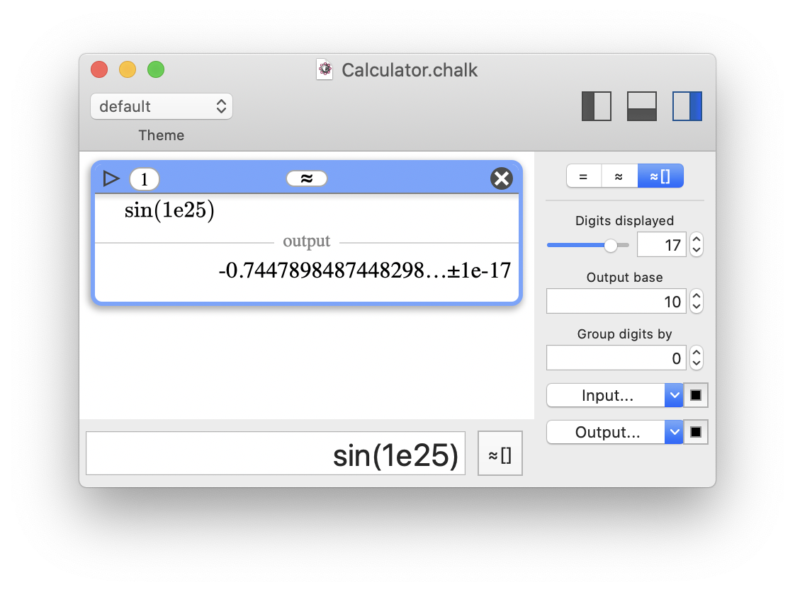 Chalk's third representation mode (≈[]) will display the value with the inaccuracy.
And there's more!
Chalk can track inexact flags in all the operations of an expression, and can report which operations are responsible for the approximation
in the final result.
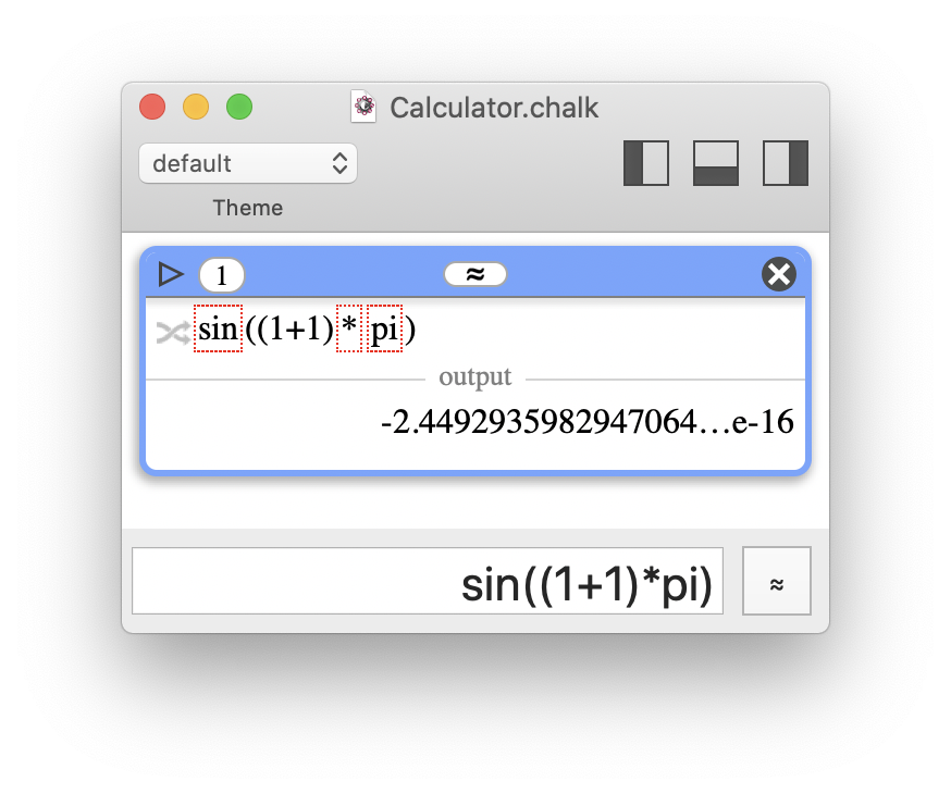 Computing sin((1+1)*π) is not exactly 0 as expected, there is some inaccuracy. Here, with the precision of 53 bits (please note that it would not be better with higher precision), 1+1 is exact, but π, * and sin() are responsible for inaccuracy. This is indicated with a red dashed box (and is more explicit when the mouse pointer is hovered on the box). The button on the left of the expression allows the user to switch between the pretty print and text representations, which will reveal the inexact flags.
Please note that flags are not limited to inexact
; there are also overflow
, underflow
, not-a-number
, division by 0
, and invalid exponent
flags.
However, please note that some operations can kill the inaccuracy, like multiplying by 0. In such cases, inexact flags will show a history of inaccuracy, but the result is exact and is therefore not followed by …
.
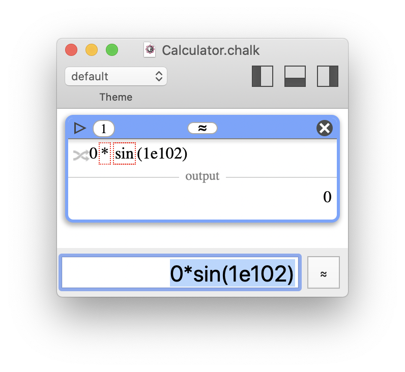 Multiplying by 0 gives exactly 0, whatever the approximation of the other operand (as long as it is not an infinity or "not-a-number"). The inexact flags show a history of inaccuracy, but the result is correctly displayed as exact.
Deliberate inaccuracy
Chalk also supports intervals on input, with several different syntaxes.
For instance, [999;1001] can be written as:
- [999;1001]
- 1000±1
- 1000±0.1%
- 1000±1‰
- 1000±10‱
- 1000±1000ppm
- interval(1000,1)
This offers a very practical solution to propagate measurements error in computations.
Under the hood
This section is intended for developers and aims to provide more details regarding the implementation.
- To support interval arithmetic, Chalk relies on the MPFI library, which is based on the MPFR library. Chalk is also embedding the ARB library for some specific functions, but ARB is not used as default (despite being very efficient), because it cannot represent asymmetric intervals with one bound set to infinity.
- Displaying correctly approximate numbers as a string of characters with an ellipsis cut in the right place was already a challenge. But writing approximations and inaccuracy with all the possible cases of exponents was a nightmare. Now that it works… I hope I'll never have to touch it again.
- MPFI does not include all the functions that Chalk would need. Some of them had to be built upon the existing ones, with pessimistic behavior to guarantee true digits. For instance, non-napierian logarithms may give less precise results than expected because pessimistic rounding pile up during successive operations on napierian logarithms and divisions.
Even more!
I built Chalk with several goals in mind, and one of them was obviously to provide true digits. This had huge implications, and achieving this goal required developing a specific internal structure and using specific libraries. By nature, Chalk ended up featuring many powerful tools. A great side effect for the users (and myself) is the ease with which one can build upon Chalk's foundations and effortlessly add more features (for free
).
From more math to more features
Let's talk about arbitrary large integers. You immediately want to test primality and decompose them into prime factors, right? Maybe you don't think about it now, but trust me, you will. So something had to be done to let Chalk handle prime numbers correctly.
The GMP library already supports most prime-related functions, but it's not enough. The real question is how you interact with them.
Consider this:
- What kind of
value
should the result of a prime decomposition be? It's neither a number nor an interval. So, how should you represent it on a calculator? - For large integers, primality is probabilistic. By design, Chalk always aims to represent the truth. So, how do you indicate that a number is
almost certainly prime
, but thisremains probabilistic
?
These two points alone led to the implementation of two features: lists
and extended booleans
, which became major features of Chalk as they were perfectly adapted to other tasks.
Lists
The prime decomposition of numbers is a list of numbers and their exponent. In Chalk, it is represented as a list of lists. Computing primes(1500) will return the list {{2,2},{3,1},{5,3}}, which must be read as 22*31*53. After building the notion of list with the syntax {—}
, several operators had to be implemented:
- accessing elements (indexing, or subscripting with the syntax
[—]
); computing {4,5,6}[0] returns 4 - Cartesian products; computing {1,2}*{3,4,5} returns the list {{3,6},{4,8},{5,10}}
- a friendly wrapper to call the same operation with several values; computing abs({-2,-1, 0, 1, 2}) returns the list {2,1,0,1,2}
And just like that, from a required structure implemented for one specific usage, lists became a very practical tool!
"Booleans" with more than 2 values
I may have mentioned this a few (or many) times, but I built Chalk with one major constraint: always tell the truth
. Therefore, Chalk had to handle uncertainty in computations. By extension, the answer to some predicates cannot be a simple yes
or no
, there can be some uncertainty. A prime number that is claimed to be prime with a probabilistic test is almost certainly prime, meaning there is a very low chance that it is a false positive. In some way, this is fuzzy logic. But this isn't really Chalk's scope, and therefore, it needed something simpler.
That's why with Chalk I took the liberty to tune a little boolean values
. They should not really be called boolean
, but I couldn't come up with anything else (or better). A predicate in Chalk can return:
- true or yes
- false or no
- certainly, which means almost true
- unlikely, which means almost false
- maybe for everything else
If these had to be translated into numerical values, they would be something like:
- true = 1
- certainly = 1-ε
- maybe = ]ε;1-ε[ (or something like a 0.5 probability)
- unlikely = ε
- false = 0
Boolean operations like NOT
, OR
, AND
can be implemented. NOT
is taking the opposite
, OR
is a max(), and AND
is a min().
| NOT | false | unlikely | maybe | certainly | true |
|---|---|---|---|---|---|
| true | certainly | maybe | unlikely | false |
| OR | false | unlikely | maybe | certainly | true |
|---|---|---|---|---|---|
| false | false | unlikely | maybe | unlikely | true |
| unlikely | unlikely | unlikely | maybe | certainly | true |
| maybe | maybe | maybe | maybe | certainly | true |
| certainly | certainly | certainly | certainly | certainly | true |
| true | true | true | true | true | true |
| AND | false | unlikely | maybe | certainly | true |
|---|---|---|---|---|---|
| false | false | false | false | false | false |
| unlikely | false | unlikely | unlikely | unlikely | unlikely |
| maybe | false | unlikely | maybe | maybe | maybe |
| certainly | false | unlikely | maybe | certainly | certainly |
| true | false | unlikely | maybe | certainly | true |
This is simpler than fuzzy logic and already very useful. If Chalk returns yes
or no
, you can take it for granted; certainly
or unlikely
are theoretically not sure, but practically usable; maybe
is for the rest. I don't think it's worth having more states, and I haven't met practical cases where I needed something else.
For instance, if a primality test returns true, then it is 100% prime: it's a known prime or a deterministic test has been conducted. If the answer comes only from a probabilistic test, the result is certainly.
Actually, this extended-boolean logic is not very useful in computations. So why is it a big deal in Chalk? Is it only relevant for primes?
The answer lies within Chalk's grapher tool!
Under the hood
This section is intended for developers and aims to provide more details regarding the implementation.
- There are many small primes, way more than I thought. The millionth prime is only 15,485,863. So, I thought it would be a good idea to build a table for the first primes to speed up prime decomposition. But it grew very quickly and became quite large, even with a clever storage system using a bit array to store primes as indices. The table containing primes is almost the biggest part of the Chalk application: a 14 MB bzip2 compressed file containing the first 23,163,298 primes (i.e. up to 436,273,009). You may wonder why I stopped there? Well, before 436,273,009, the gap between two successive primes is at most 249, but after this number, the maximal gap is above 281. I thought that it would be interesting to set the limit so that the gap was an 8-bit value. In the end, I needed an excuse to set a limit for the number of cached primes, and that seemed like a good one! I also think that it was less artificial than
going up to the 25 millionth prime
orsetting an arbitrary size limit (in MB) for the cache storage
. - The Miller-Rabin probabilistic test is certainly the most popular test for checking primality. But I wondered what the first known prime for which there was a realistic risk of failure was; the idea was to avoid returning certainly instead of true. However, this isn't a well-defined question; there is an asymptotic probability related to a robustness parameter. So I ended up changing my mind, and I looked for a deterministic Miller-Rabin test. I eventually found a satisfying answer with a well-known set of divisors to test up to 3,317,044,064,679,887,385,961,981. The key feature here is that Chalk does its best to give a non-probabilistic answer.
- Chalk also includes an up-to-date list of all known Mersenne primes.
A grapher that doesn't lie!
A good grapher is hard to build. It requires many user features to make it nice, friendly, and powerful. Although Chalk includes a built-in grapher, I must confess that it is pretty basic and rather slow compared to other graphers.
So why did I dedicate time and energy to implement a slow, basic grapher in Chalk? And most important, why am I highlighting this feature?
Having read through to this point, you are now familiar with the big idea behind Chalk's development, always tell the truth
, and how it influenced its conception. Graphers usually have severe shortcomings, that Chalk, by nature, can handle correctly.
Rendering curves correctly
The root cause of many graphers shortcomings is not difficult to describe: graphers fail because of sampling issues. Either they poorly render numerical instability, or they do not catch thin irregularities. Look at the following screenshots:
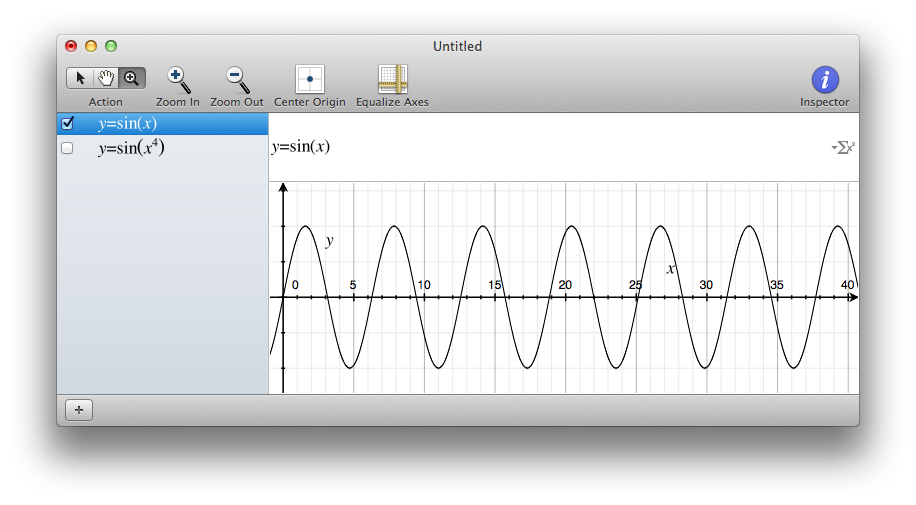 Here is a beautiful sinus rendered using macOS's Grapher tool.
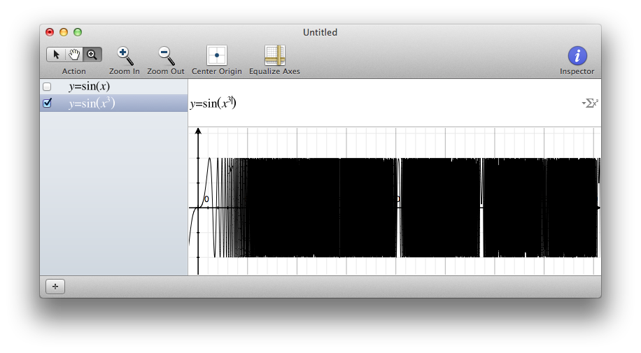 Now that x has an exponential behavior, the sinus has numerical instability. This is expected, but the rendering is just wrong. "Holes" shouldn't appear in the middle!
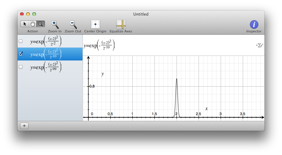 Here is another example, a beautiful thin Gaussian under macOS's Grapher tool.
 If I make the Gaussian even thinner, it isn't displayed anymore, and this is just wrong!
The issues illustrated above all have the same origin: a pixel on the screen has a width, and you can't ignore it if you don't want to miss sampled data. More, a pixel width is exactly the representation of interval arithmetic. Good news, this is one of Chalk's main features. Therefore, Chalk plots things taking into account all the values in the area of a pixel!
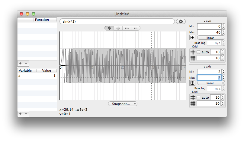 Chalk displays an "approximation" of the curve plotted in black, which gives the user an idea of what is going on. Don't be mistaken, the rendering of sin(x3) is as wrong with Chalk as it is with any other regular grapher. But a gray shaded area highlights the uncertainty interval, which quickly becomes [-1;1].
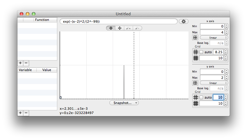 No matter how thin it is, a Gaussian will always be at least one pixel wide in Chalk, so you can't miss it.
Rendering predicates correctly
Chalk being able to perform interval arithmetic on curves is already a helpful tool. But if you combine that with extended-booleans, you can go even further. Why not render 2D predicates? Since every pixel has an area, you can get exact
results, taking into account the uncertainty.
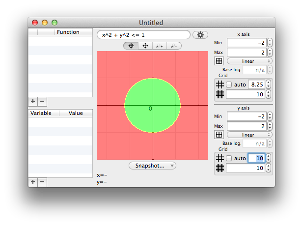 Here is the predicate of a circle. The pixels highlighted in green match the predicate, while those highlighted in red don't. The pixels highlighted in yellow cover uncertainty, because they are on the edge and cross the border.
 Here is an ultra thin 2D Gaussian. You can hardly see the yellow pixel in the middle, but it is there. Now, look at the next screenshot.
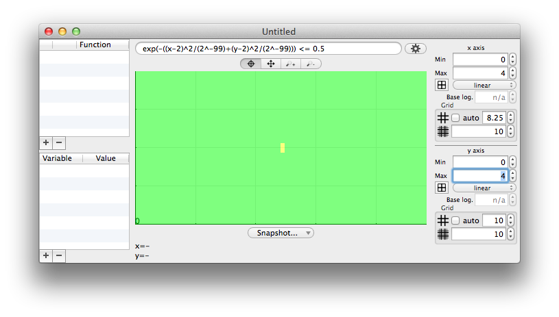 You can artificially enlarge the pixel size! You will get cruder results, but at least you're sure that you won't miss events.
Under the hood
This section is intended for developers and aims to provide more details regarding the implementation.
- Rendering curves and predicates in Chalk is slow. But it is a different kind of tool, it is pixel-exact, so it needs much more computation than a usual grapher. Indeed, the rendering time will depend on the size of the window: graphs are pixel-exact, so more pixels means more work! To be more efficient, the rendering is done in parallel among the branches of a quadtree. When an area gives a full true or false, it can be colored without any further descent. Decomposing into subintervals is done only when the predicate returns a maybe because of uncertainty.
- The most expensive descent occurs when an area gives a not-a-number, for instance because of negative values and a logarithm. In this case, a full descent is almost always necessary to make sure there is not at least one valid pixel.
An equation editor
To render mathematical expressions attractively, Chalk uses the JavaScript display engine MathJax. Using JavaScript in the background of a regular application is… hard! But it's worth the pain. And there is a wonderful side effect, Chalk gets a good equation editor free of cost!
LaTeXiT on steroids
If you are not using LaTeXiT, one of the most useful software of the last decades (you should really consider congratulating me the author), how do you quickly render equations to illustrate non-TeX documents? Now, you can use Chalk!
No, Chalk does not support a full TeX engine with all the available packages. But anything MathJax can render, Chalk does it with lightning speed! And you can export as bitmap, PDF, or SVG files. Not bad, eh?
It is not one of Chalk's main features, but it would have been a shame to miss out.
 Chalk's equation editor really looks like LaTeXiT, and has proven its efficiency.
Why build Chalk for macOS?
When I started working on Chalk (back in 2017!), I wanted to focus on development, and I could not afford to be distracted by the toolchain. So, the obvious choice was to use my favorite toolbox: Objective-C and AppKit. As much as I love these, I still had to check beforehand that bridging Objective-C and JavaScript would work for MathJax. It did, and I had all I needed.
But now that it works, is it worth porting Chalk to other operating systems?
The answer is YES, and here are a few thoughts on the subject:
- Apple made it clear they don't care very much for developers that don't make money. They add more and more fences preventing developers to work on macOS, and I for one think they don't deserve further attention. I seriously consider moving away from Apple. They completely lost touch with a large part of their audience: scientists who just want to make things work, and can't bear all those developer fees, notarization, code authentication, breaking compatibility changes, or huge bugs coming with each new OS version. Honestly, who wants to pay to develop free software? The Apple platform used to be great. Too bad they lost their way and forgot that some people use their powerful, reliable and friendly desktop machines to produce or enjoy useful tools.
- Objective-C is swiftly dying (pun intended!)… Swift is taking over, and at first sight, it's not a bad language. But I always seem to find myself on the wrong side of polemical choices, like the new
non-virtual
behavior of methods by default. - Chalk heavily relies on parallelization when evaluating expressions. Apple's Grand Central Dispatch is a very nice piece of work; it not only makes async code easy, but also performs clever load balancing. In comparison, standard C++ looks dumb as hell. It can spawn thousands of threads instead of properly dispatching among available cores. You always have the option of using Boost or TBB, but it's a pity to rely on a third-party library for that. Not a big deal, though.
- Chalk's graphical user interface is essential. This raises the usual questions when thinking about portability. Which GUI framework? QT? .Net? I wonder whether the best solution could be a combination of native C++ (for Chalk's engine) and .Net (for the interactions).
- Porting Chalk to another language like C++ or .Net is certainly straightforward, there are no real hacks, just standard Object-Oriented features. The main resource needed is time. Unfortunately, this is a resource I don't think I have enough to move forward.
Closing words
Writing this documentation turned out to be an excellent debugging session. While checking different behaviors in Chalk, I found dozens of subtle bugs (hiding in corners) and improvement opportunities. Maybe that's something I should have kept quiet, but my fellow developers know that it can't be any other way.
If I had to summarize, I built Chalk with the following features in mind:
- Provide a light tool that can replace the OS default software calculator; a tool that starts quickly and doesn't clutter the screen.
- Design a tool that, by nature, will help users to know what they are typing and what they get in return, without confusion; if you type something wrong, you will be able to see it.
- Break the limits of conventional software calculators; if you need 1 billion digits, you will get 1 billion digits.
- Always tell the truth, and if there is uncertainty, report it; you always know if a result is 100% exact or has some uncertainty (the uncertainty itself is known).
- Only display useful information; there are no garbage digits, all the digits displayed are true in respect to the current rounding.
There is only one thing that I would like to see in Chalk but is currently missing: formal values handling (like 2π), propagated as long as an estimation is not needed. It's a work in progress, given that I had to build a robust everything else
beforehand, and I hope I will make it happen (time permitting).
To the best of my knowledge, Chalk has no equivalent. But I would be delighted to be wrong, since it would prove that computers are still seen as important tools and not waste-your-time machines.
Last edited: 7th March 2022
Special thanks to Jean-Yves Bleuyard for english proofreading. All mistakes are mine after his review.
Special thanks to Paul Zimmermann for additional comments.
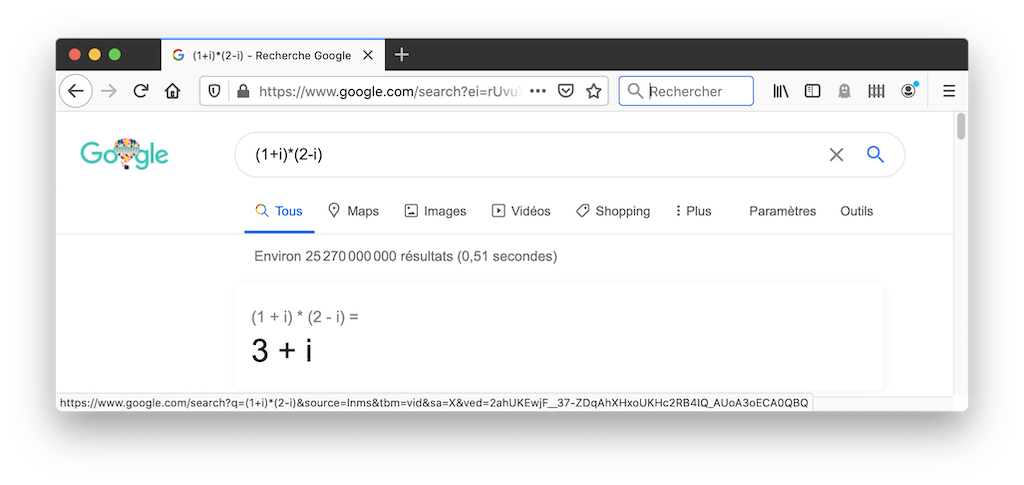 Jokes apart, the Google search engine is a pretty good calculator.